
Redesign of Learning Management System
![]()
Client: TicTac Learn
Goal: Redesign the GO+ platform to improve usability and modernize its visual identity
Target group: LMS administrators and learners
My tasks: UX/UI design, brand design, research, testing
Year: 2021-2023
The challenge and solution
GO+ is a Learning Management System (LMS) with over 1 million users worldwide. The project aimed to simplify the platform’s user experience while maintaining powerful administrative tools for creating and managing learning modules.
We redesigned the platform's user flows, interactions and UI, while improving its market positioning with a modern, user-centered design approach.
Key process highlights
I played both a creative and strategic role in shaping the UX/UI design and the brand identity of GO+. In addition, I planned and conducted user testing, analyzed key pain points, and ensured the redesign aligned with both user needs and business goals.
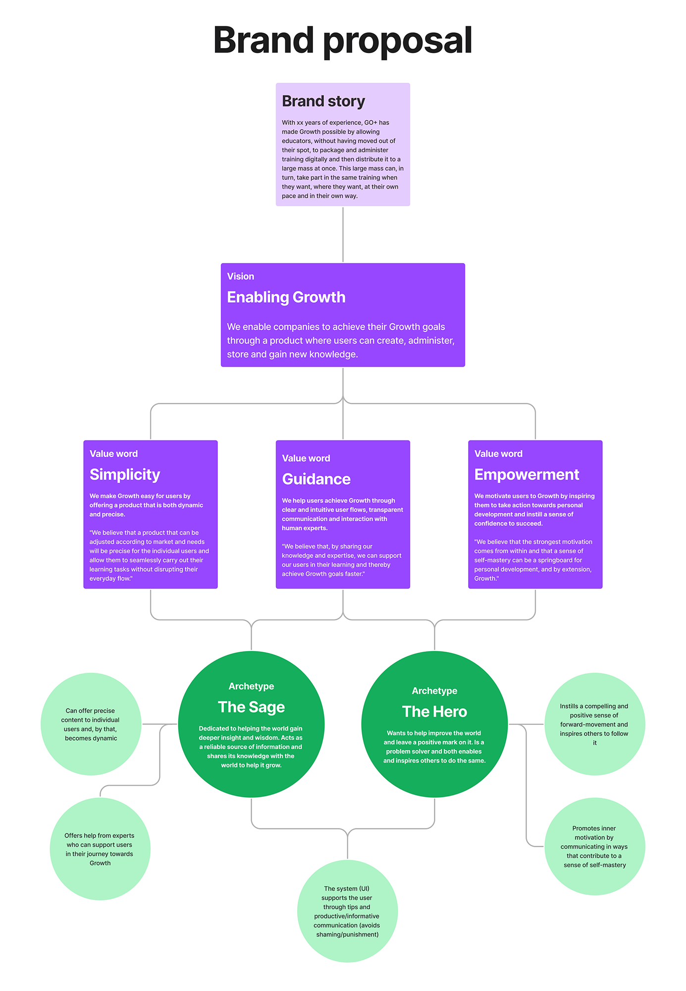
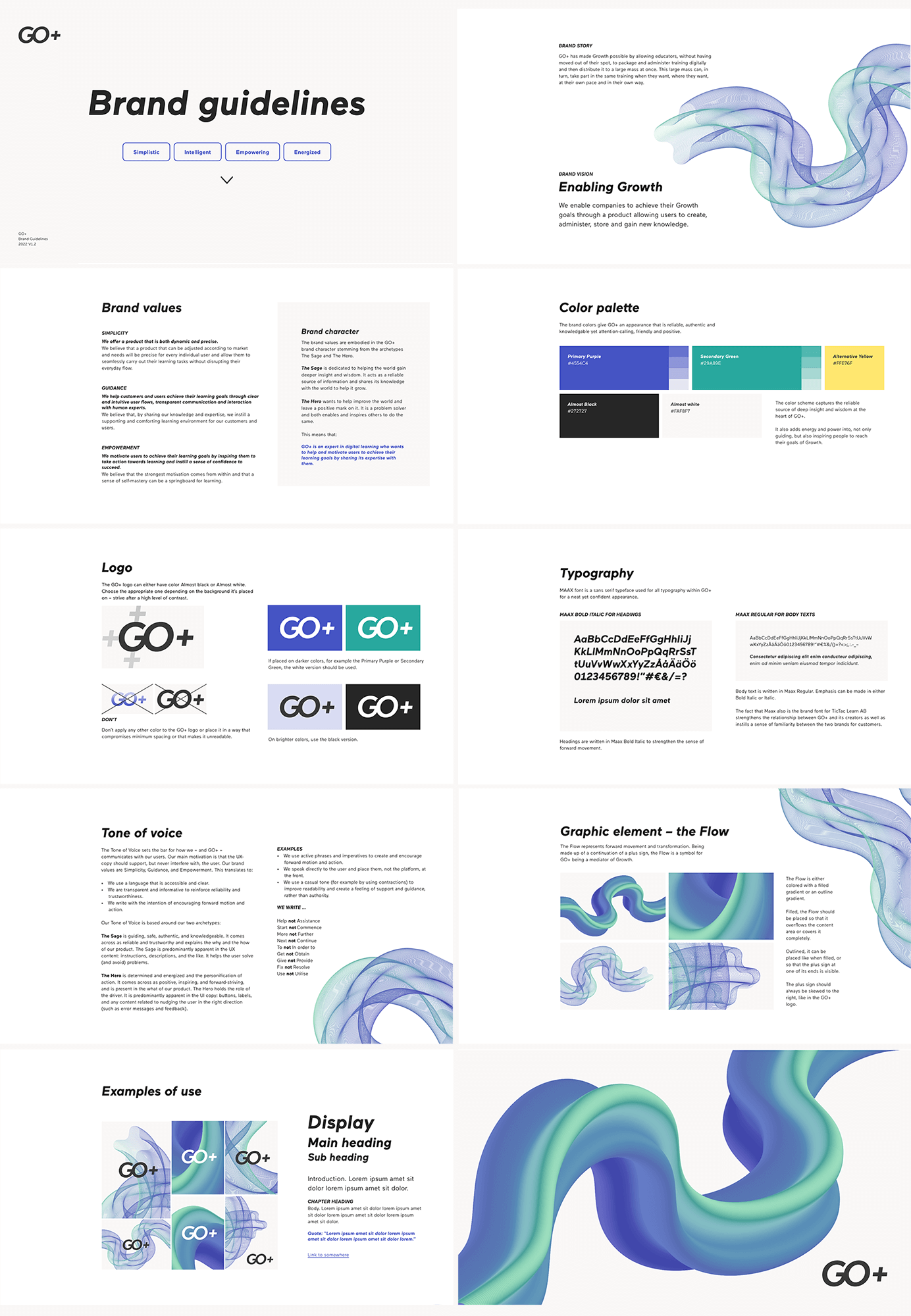
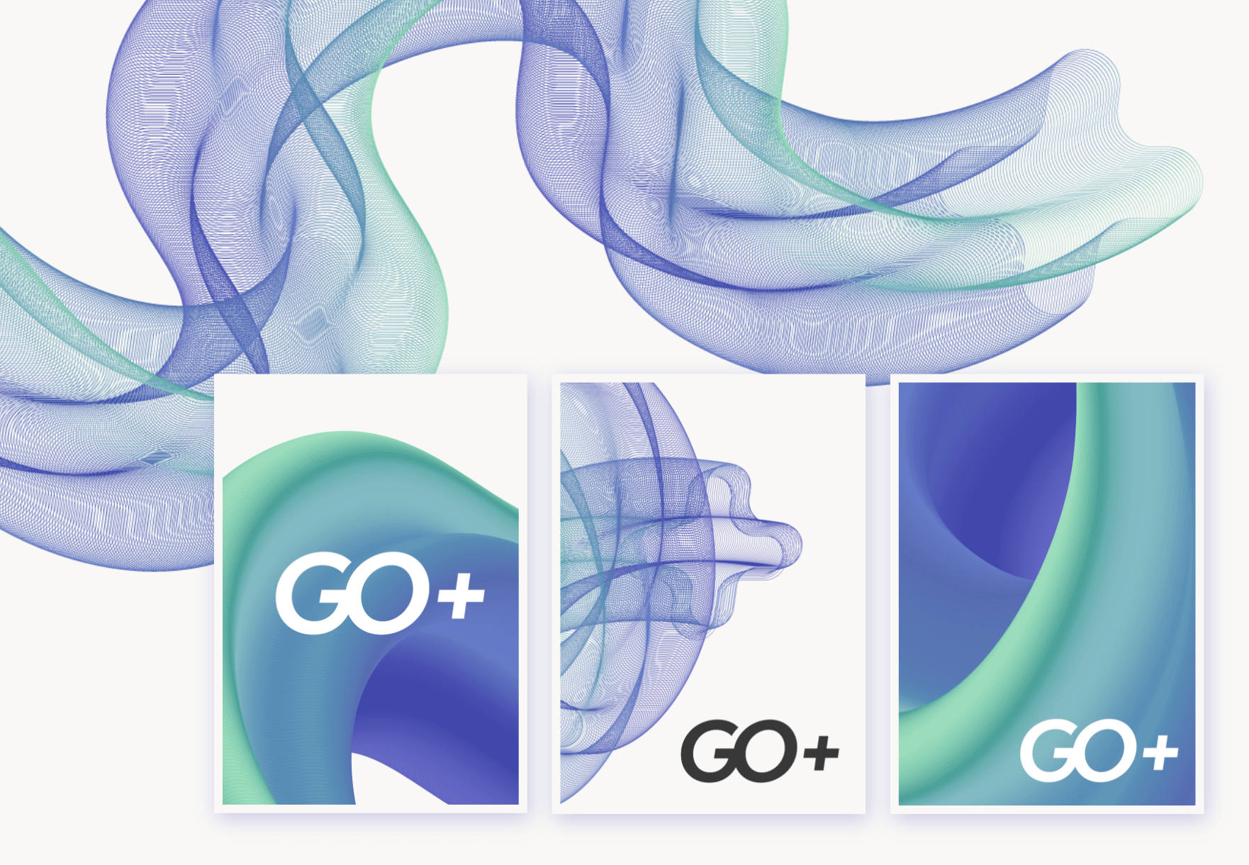
The brand
The GO+ brand lacked a clear identity and overall direction, so I suggested creating a solid foundation to make grounded design decisions and purposeful market positioning. Working with the product owners, I developed a "Brand Character" proposal incorporating its vision, mission and values, story and brand archetypes. This became the foundation for the brand guidelines and design choices moving forward.
Continuous research
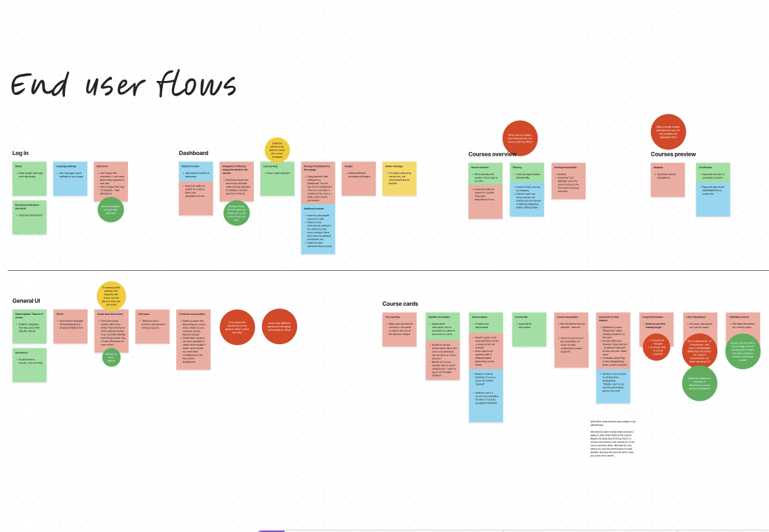
Following our sprint based roadmap, we researched many areas throughout the project; from initial user studies compiled into personas, field research of general and specific functionalities informing flowcharts and wireframes, to trends and competitor analyses for clarifying market positioning.
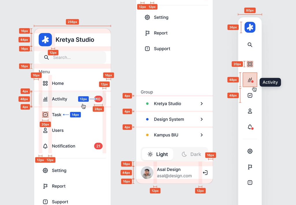
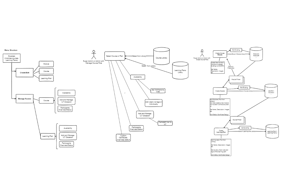
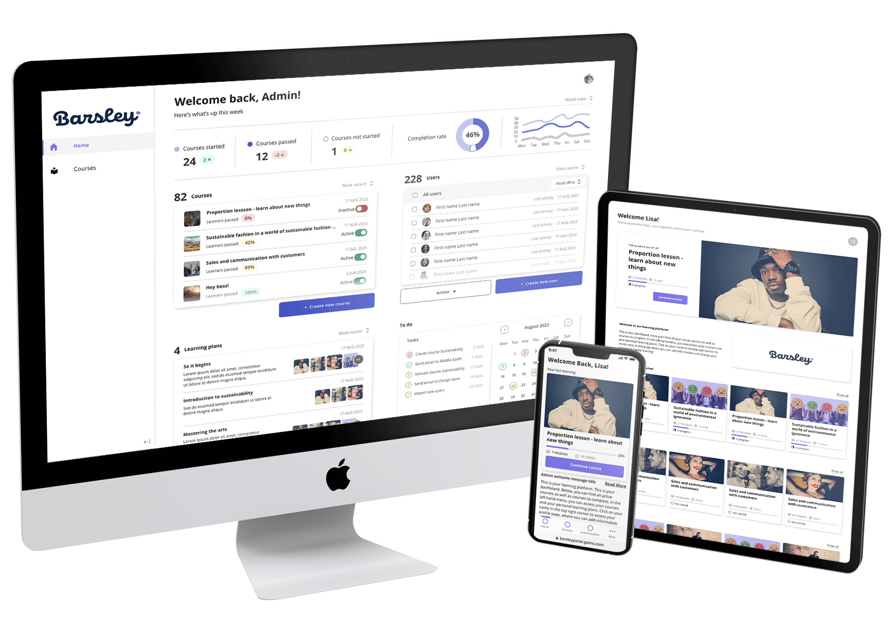
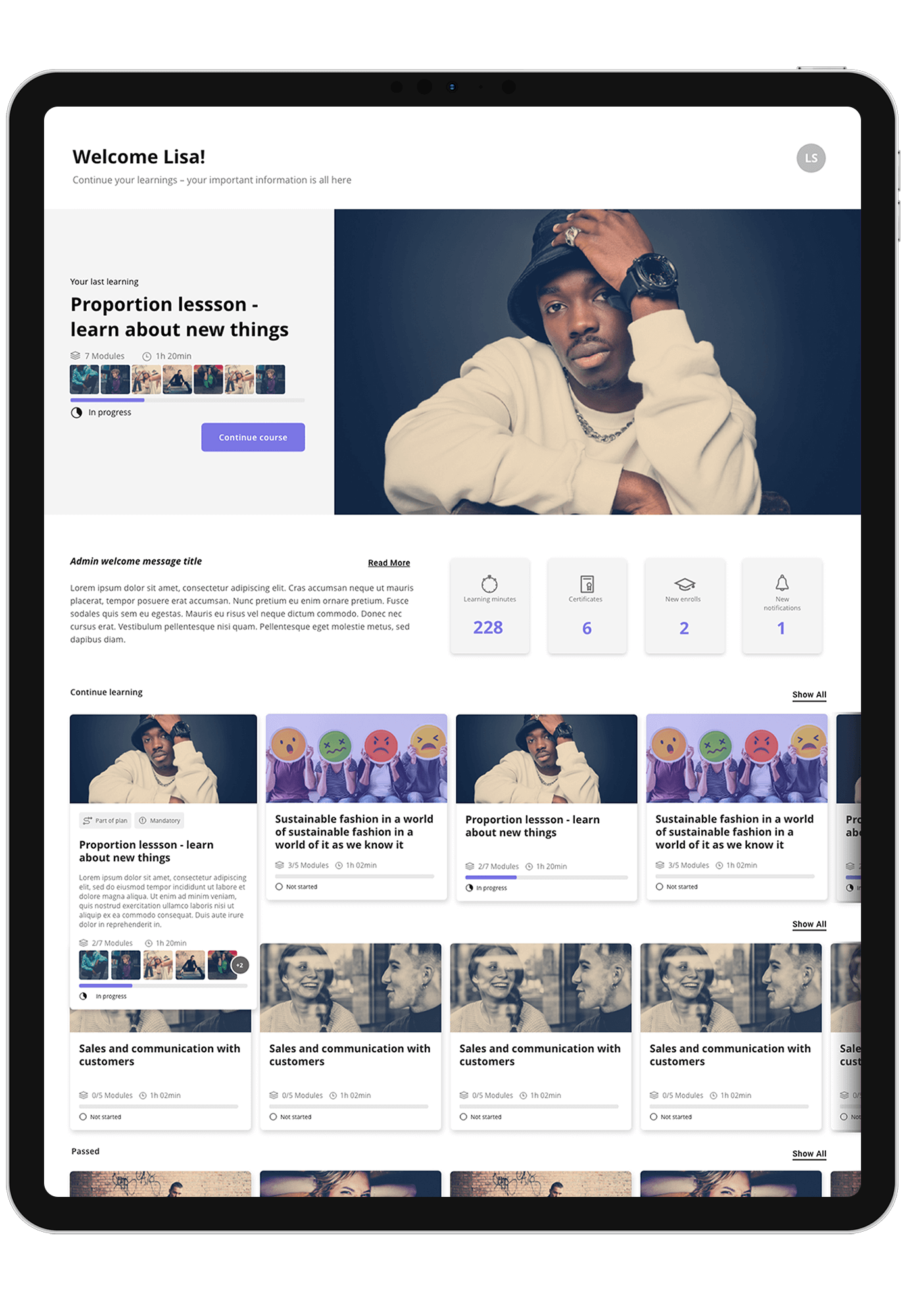
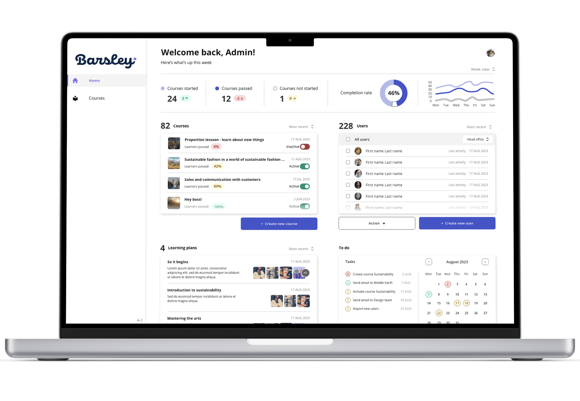
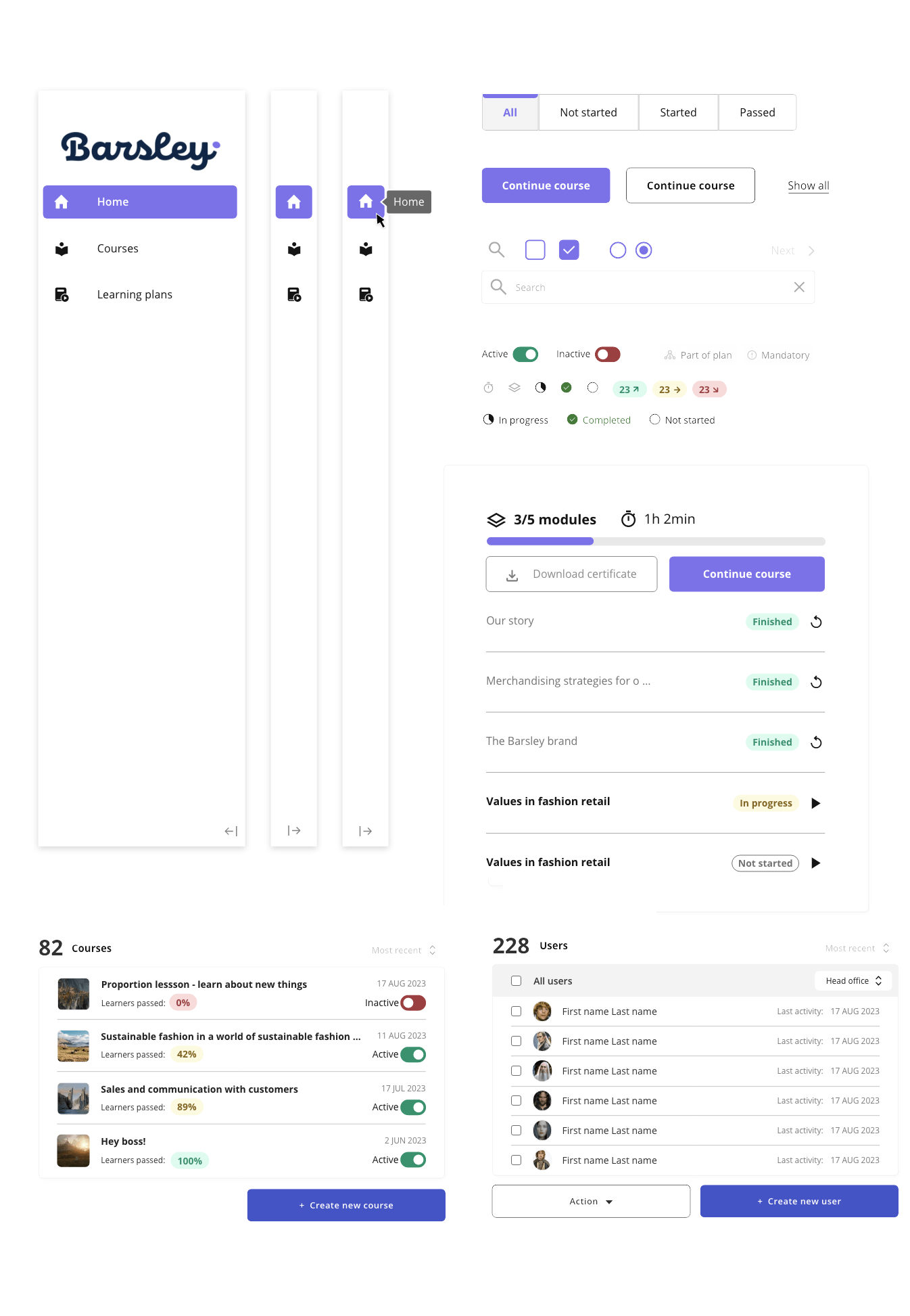
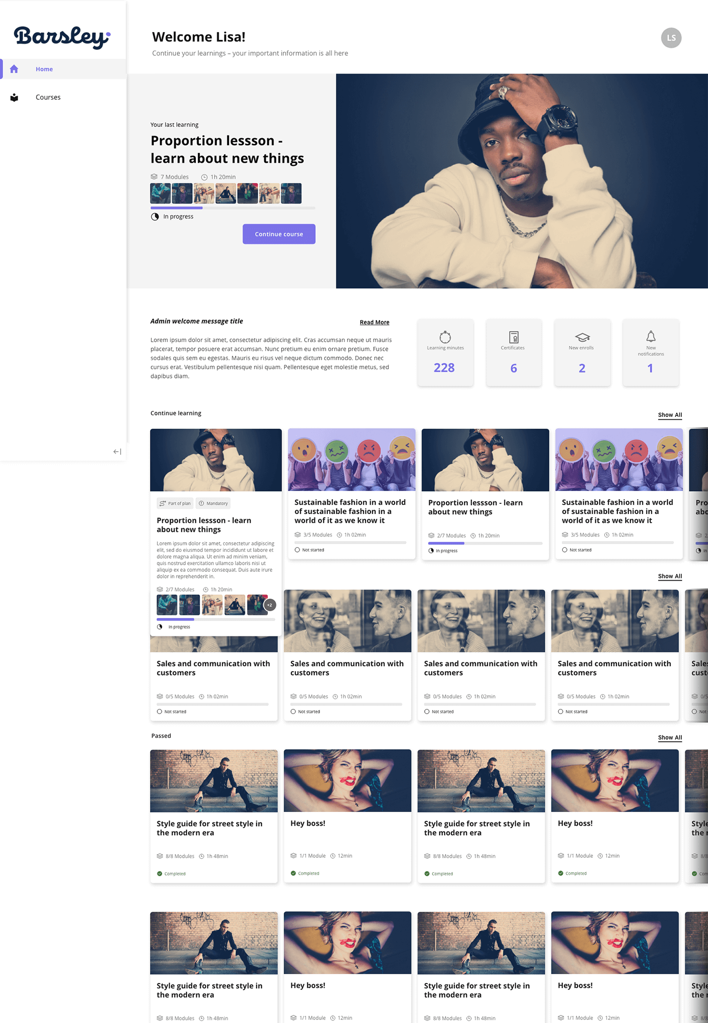
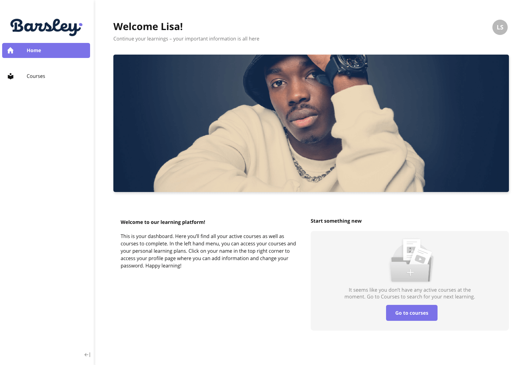
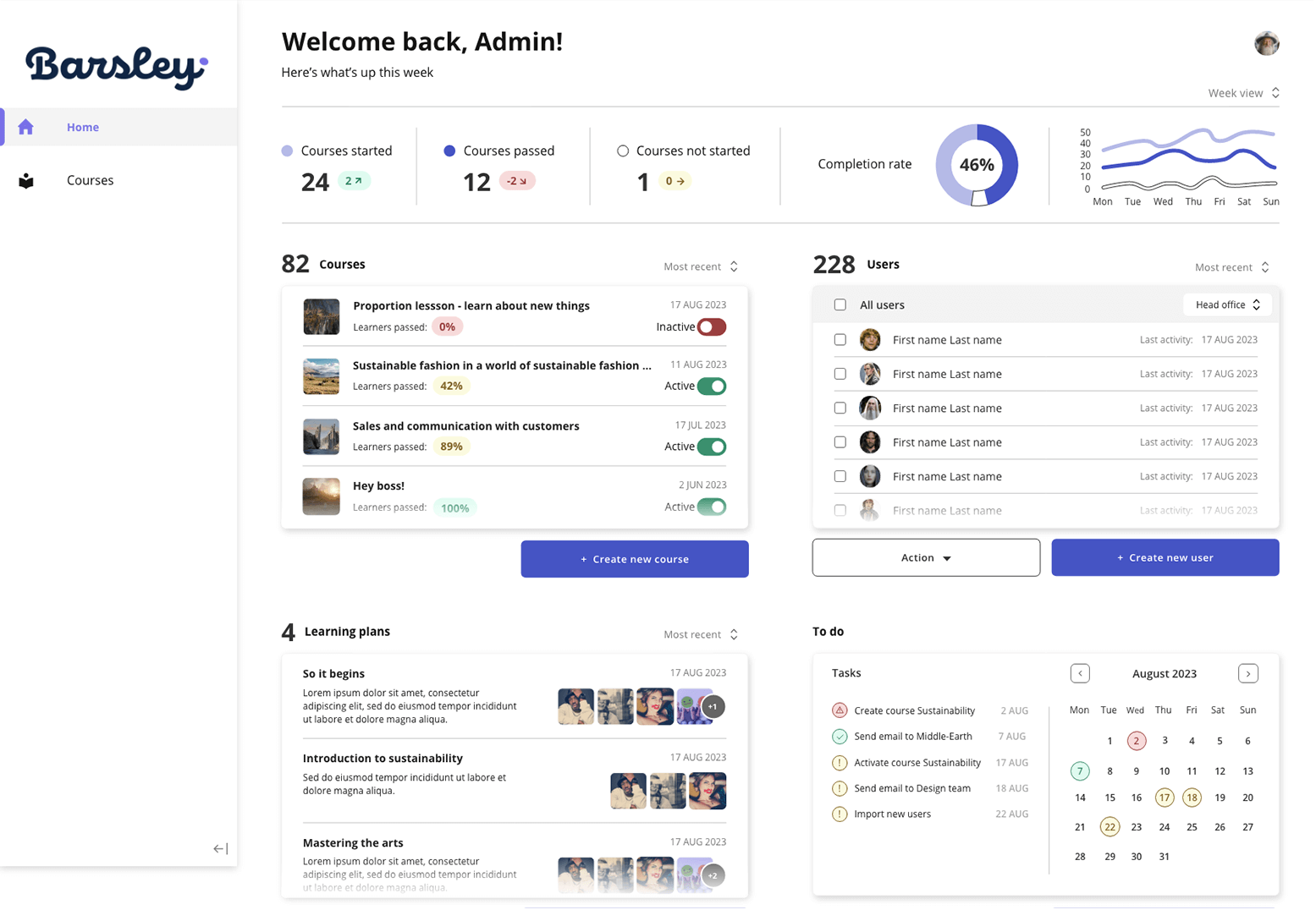
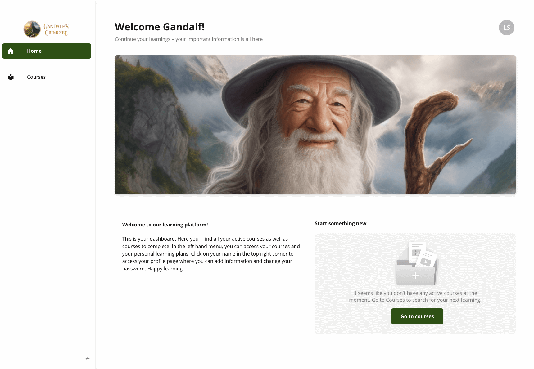
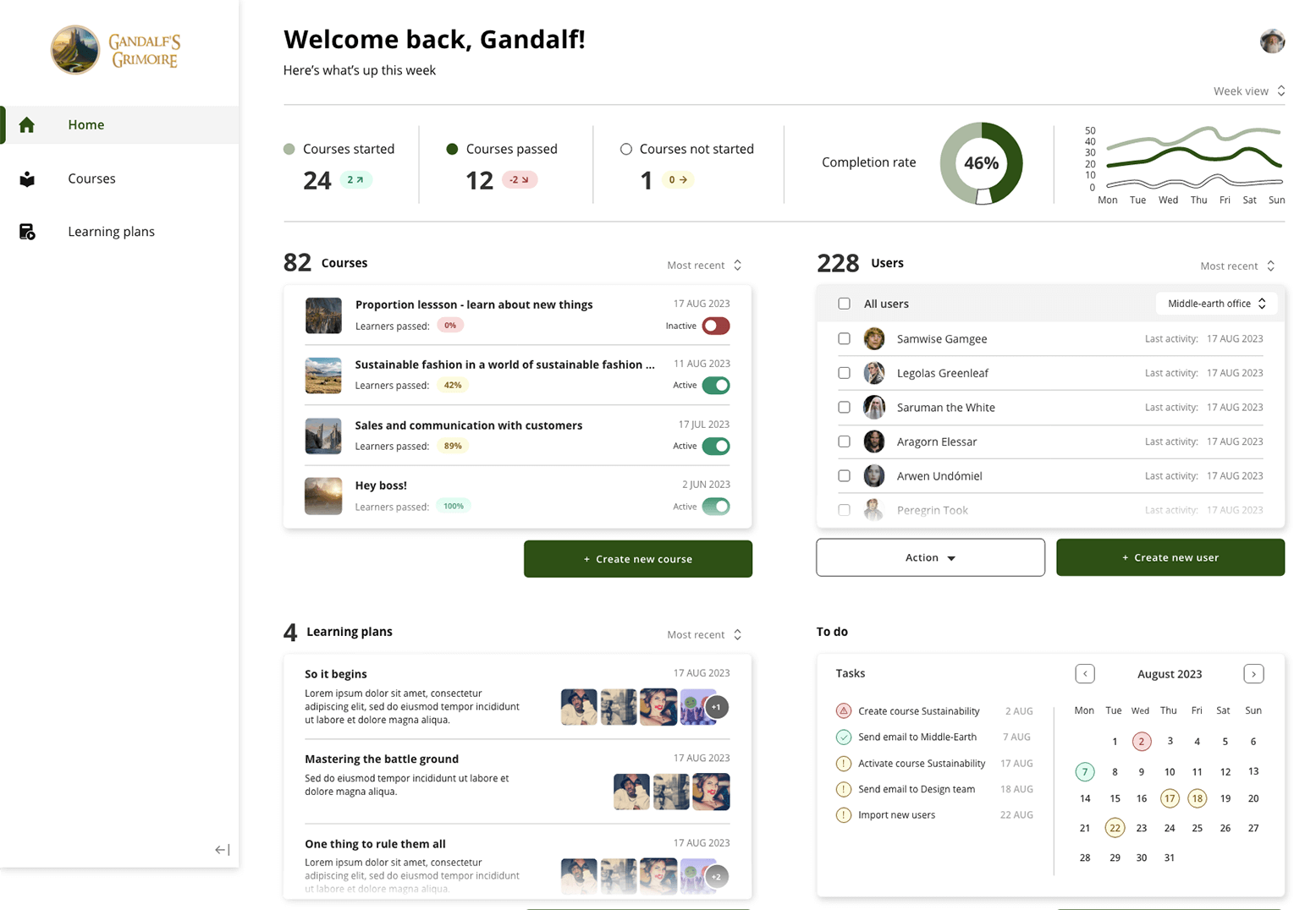
The mockups
We iterated through mockups, testing and refining the layouts of each view and user flow. In this, I reviewed and feedbacked mockups for improvement and as well as designed refined views. Once the mockups were optimized, we developed a design component library to ensure consistency and streamline the development process.
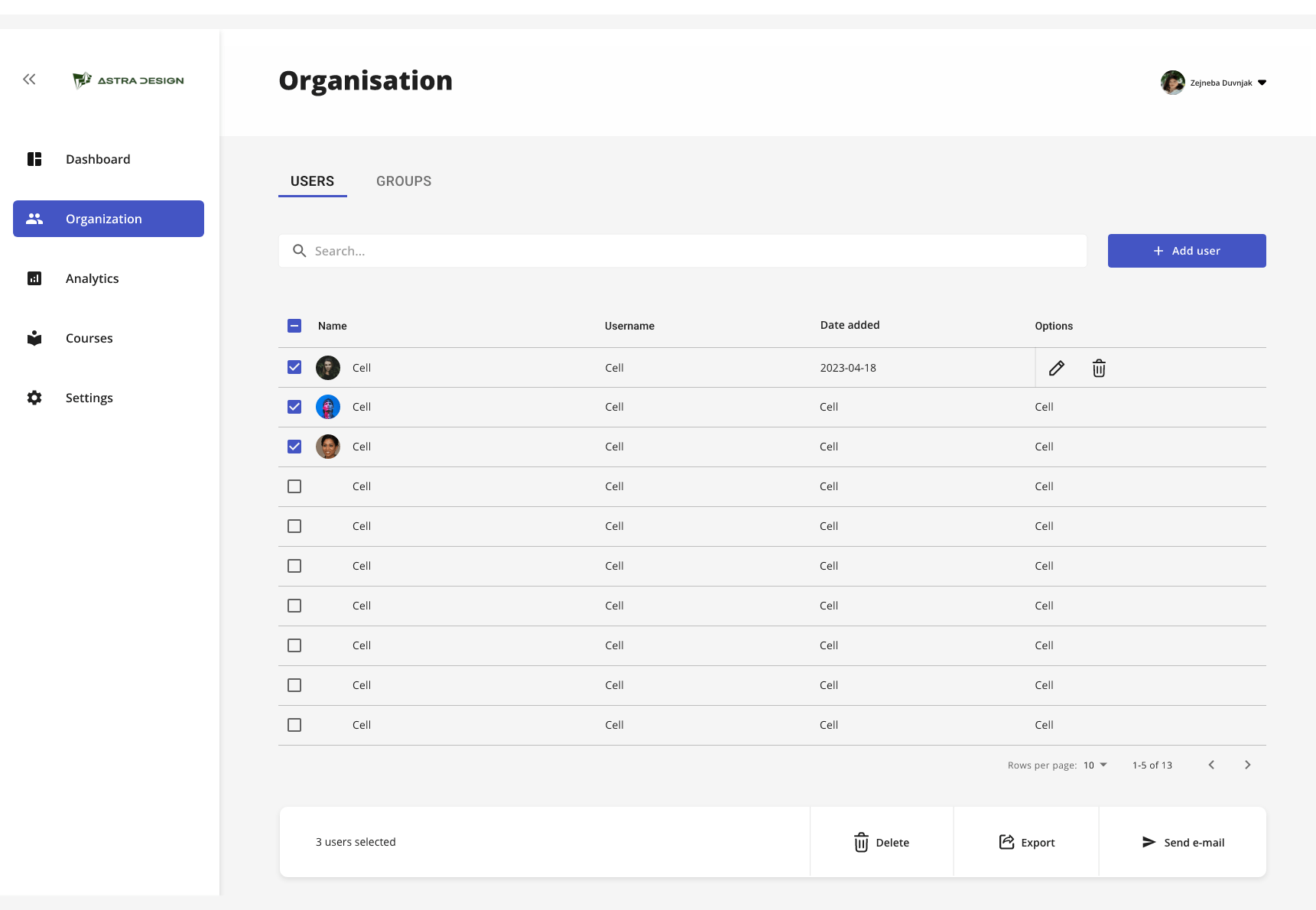
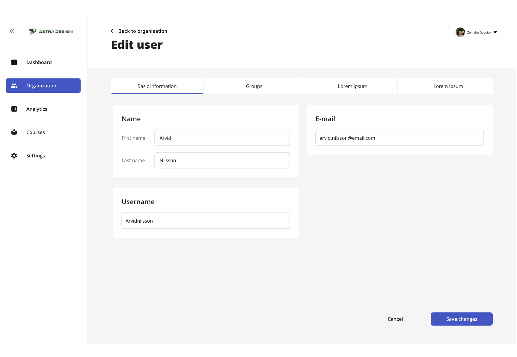
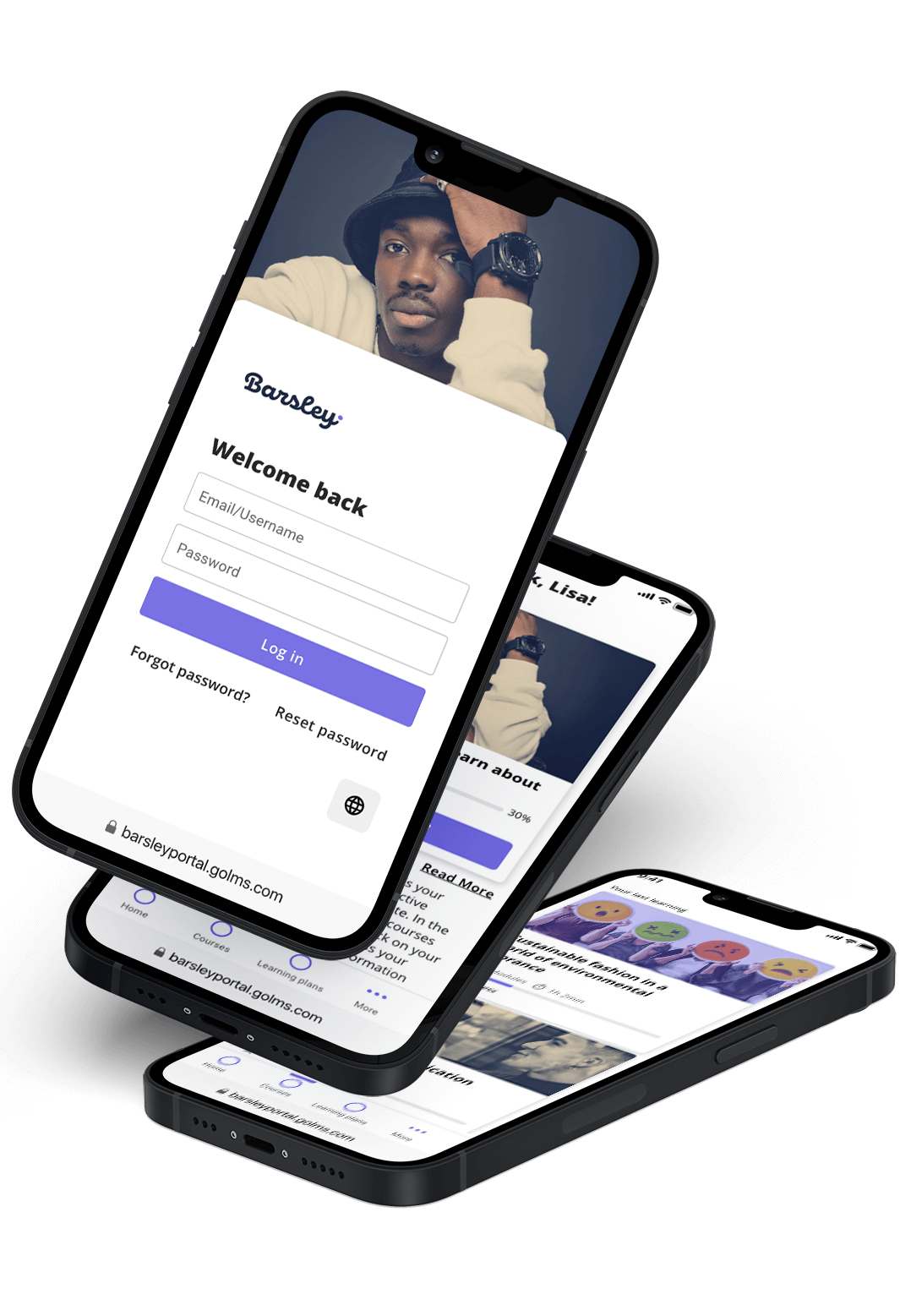
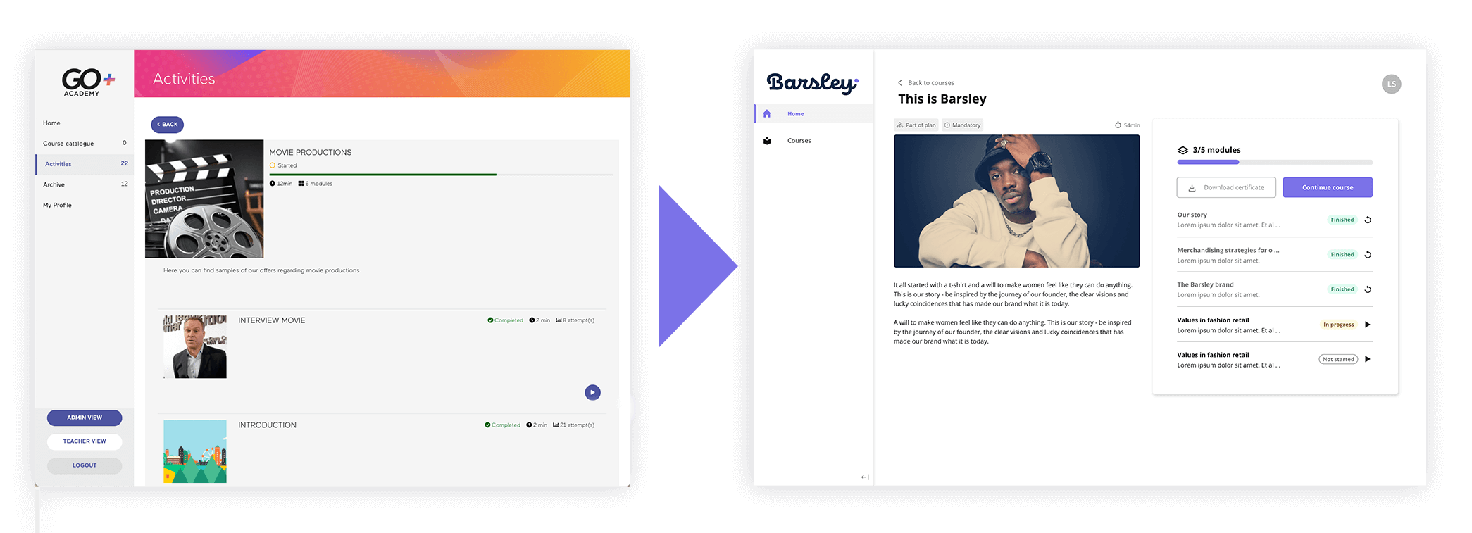
Customer portal branding
One costly problem identified in GO+ 1.0 was the manual work needed by a developer to brand every customer portal. In GO+ 2.0, we therefore introduced a 'Theme' functionality, enabling users themselves to customize their portal’s branding with colors, fonts and images.
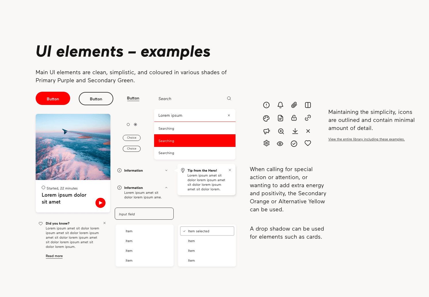
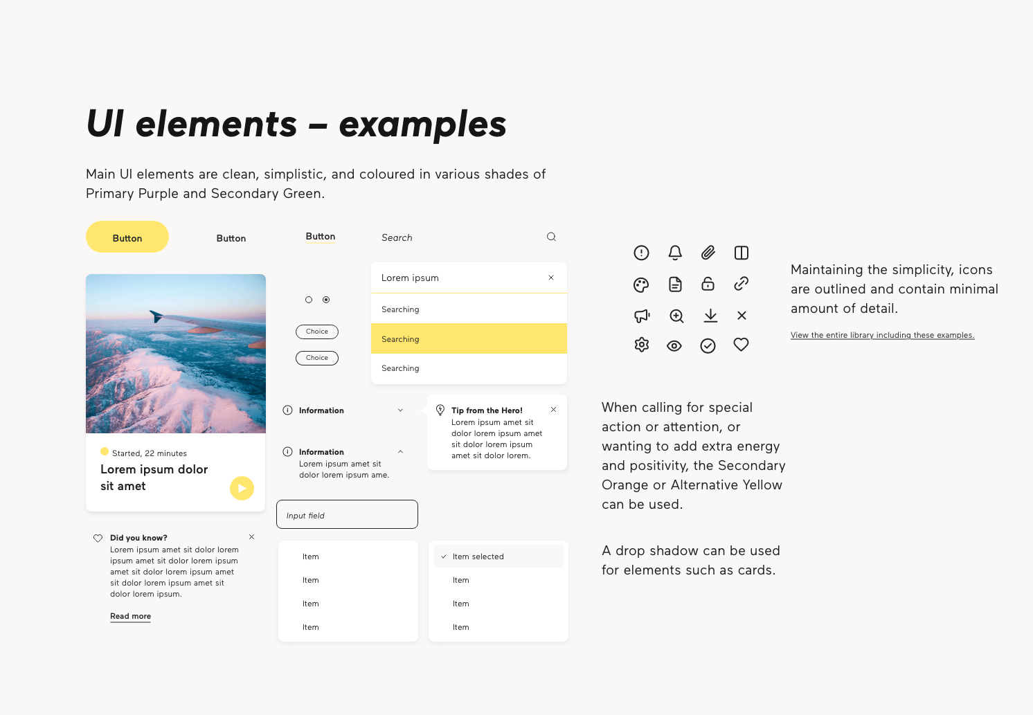
This put high pressure on the UI design as it had to work with any colors and fonts. To make it work seamlessly across the platform, I decided that our best strategy was to keep only the essential and reduce the number of elements affected by the Theme functinoality.
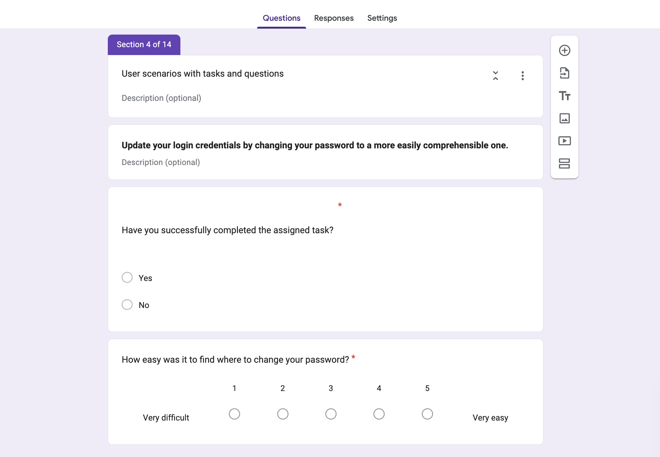
Testing
I conducted quantitative and quantitative testing of both usability and look & feel. I created one questionnary that was sent out to our customers, and one digital testing session where a few selected people were given tasks to complete within GO+ followed by interviews and discussion. This session was recorded and later analysed, from which I compiled all insights and translated to concrete design improvements to make before the release of our MVP.
Reflection
This project taught me a lot about balancing user needs with business goals. I gained valuable insights into working with stakeholders, making key design decisions, and managing the trade-offs between user experience and technical limitations. Ultimately, the development of GO+ 2.0 was discontinued due to reorganisations within TicTac.