PANTEKTOR AB
Ongoing
❮
⨯

Pantektor is an architect firm based in Malmö who specialices in logistics buildings. I have previously designed advertisements and graphic material for Pantektor´s 70 anniversary, and now I was asked to help them update their brand with a new logo and website to modernize their appearance.
Company: Pantektor AB
My roles: logo design, web design, photography
Design tasks: redesign Pantektor´s logo and website
Target group: customers within the logistics sector and job seekers within architecture/engineering
Duration: ongoing
Methods/tools: Interviews, Card sorting, Sketching, Photoshop, Photography, Illustrator, XD
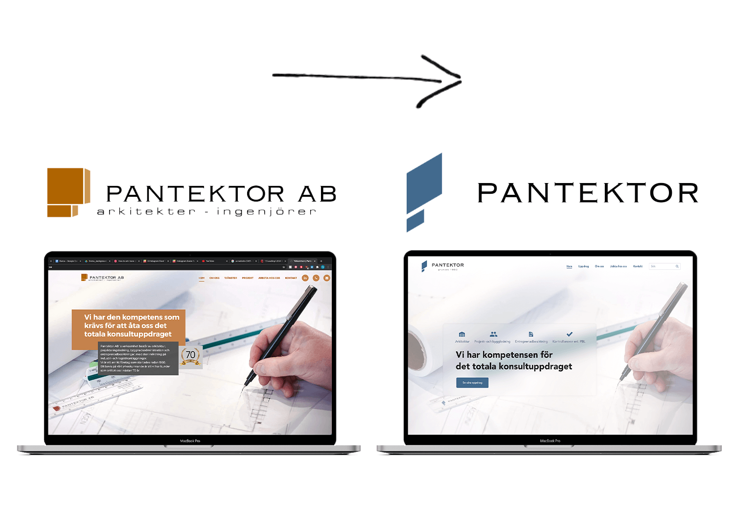
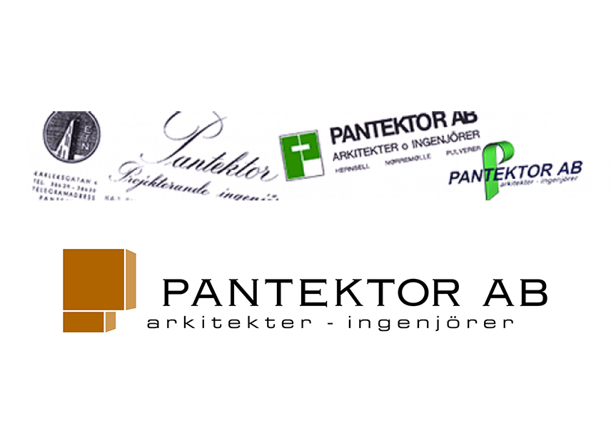
To Pantektor, tradition is important. Because of this, the initial brief was to keep qualities from the original logo so that the change would not be too drastic nor different. Since the origin of the company, their logo has consisted of their company name and more recently a logomark symbolizing a captial P which they early on said that they wanted to keep.
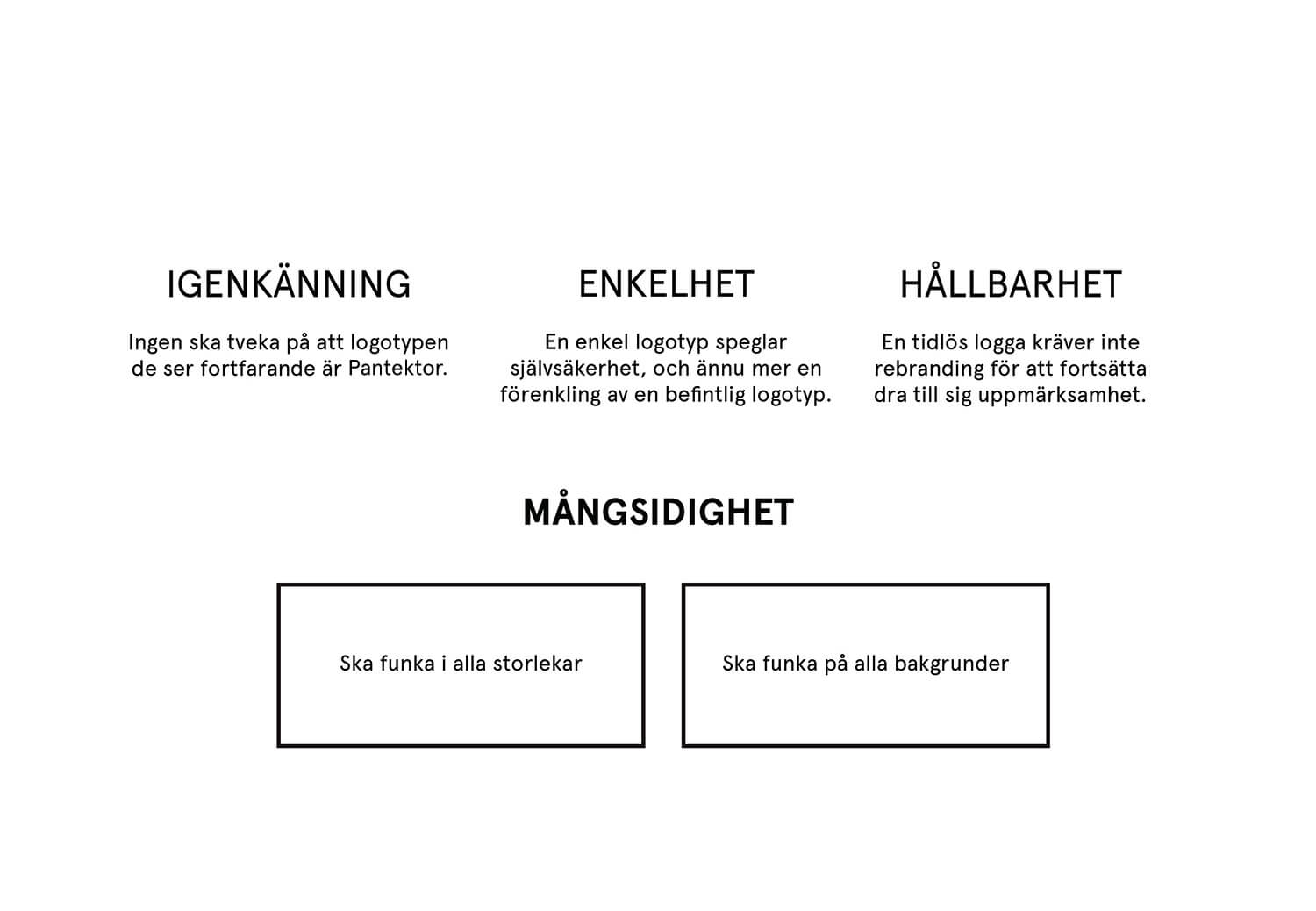
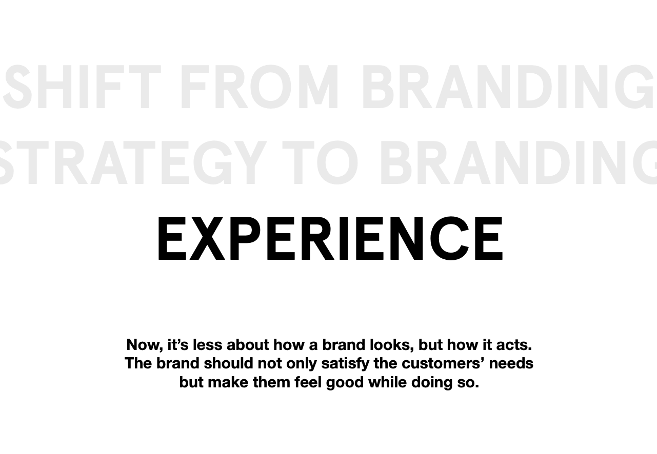
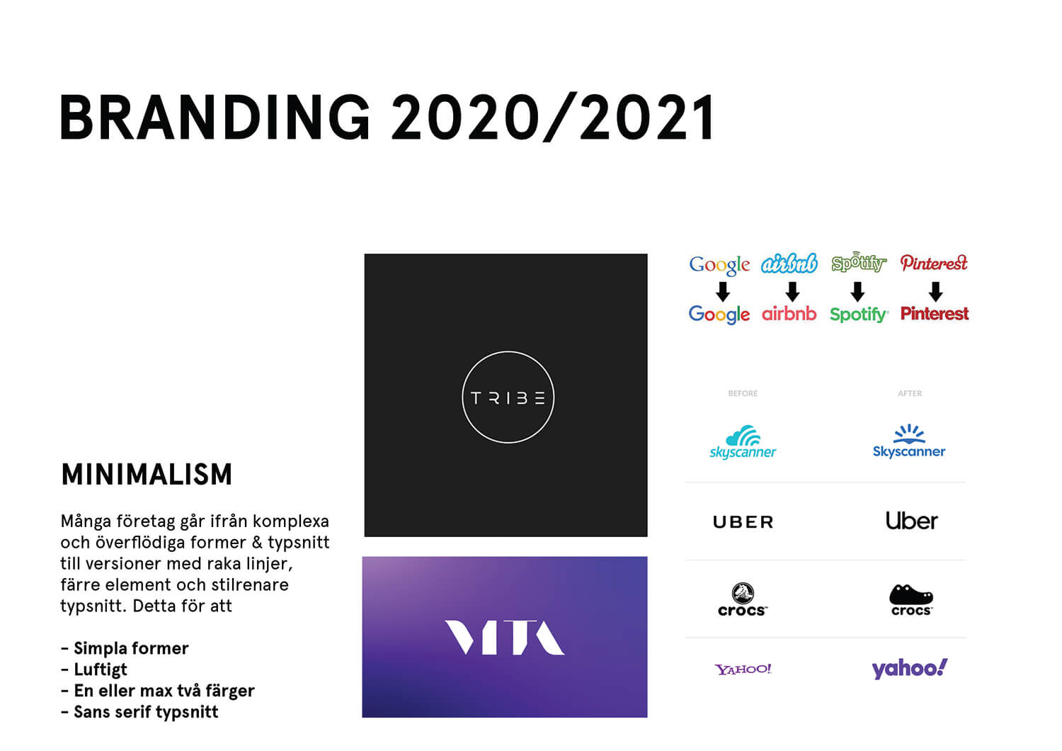
From my previous work with Pantektor, I already had an understanding of their company as well as their customers. In this project I could therefore start with boiling down keypoints of what is expected of logo design and branding for companies in 2020/2021 which led me to the conclusion that an effective logo should be recognizable, simple, sustainable and multifunctional. I saw that branding is going more and more from strategy to experience and that a logo in 2020/2021 should be minimalistic and responsive.
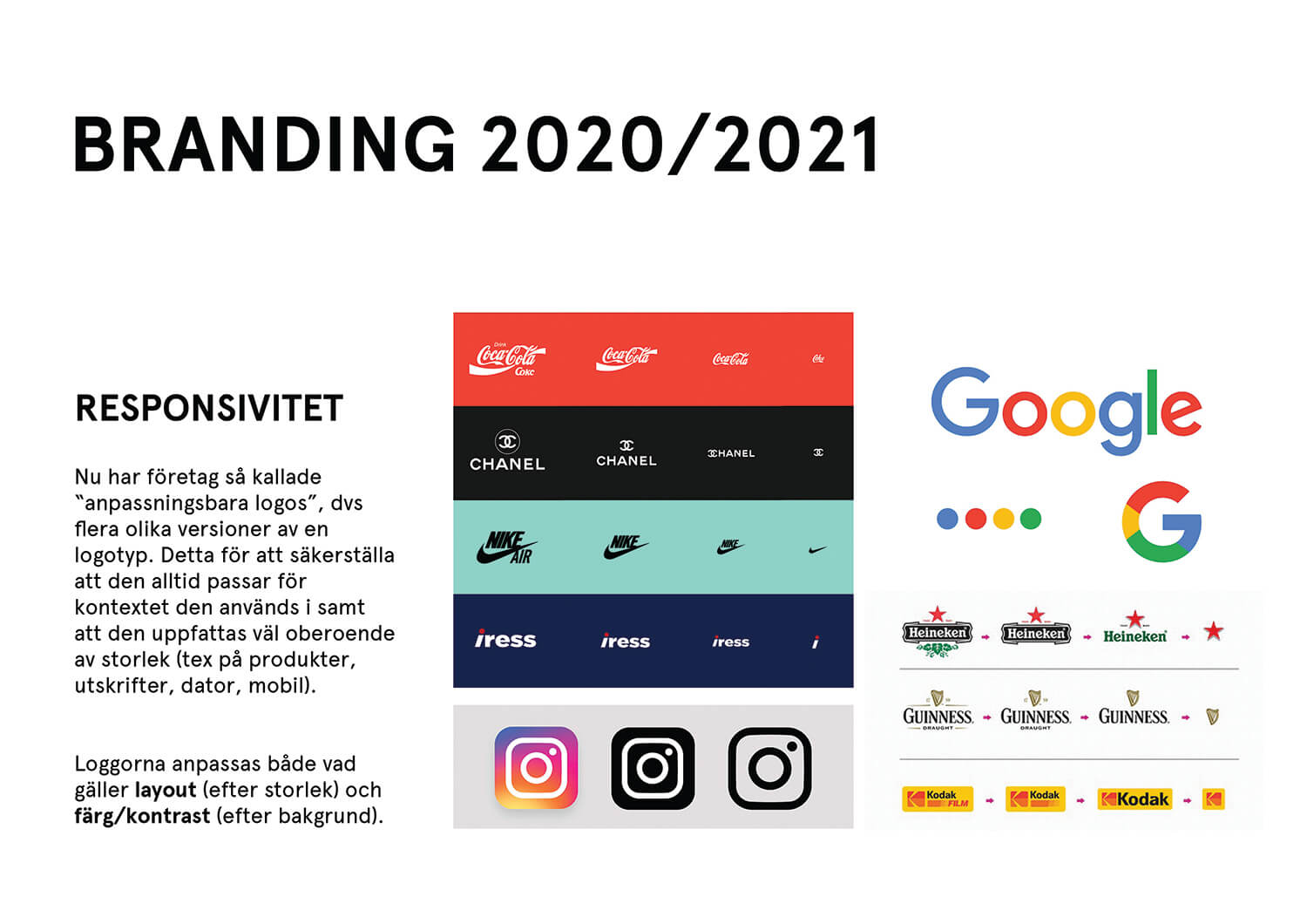
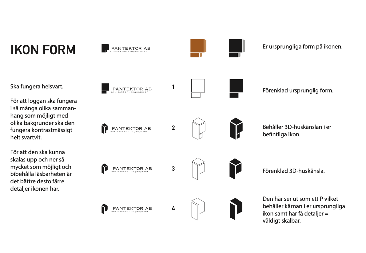
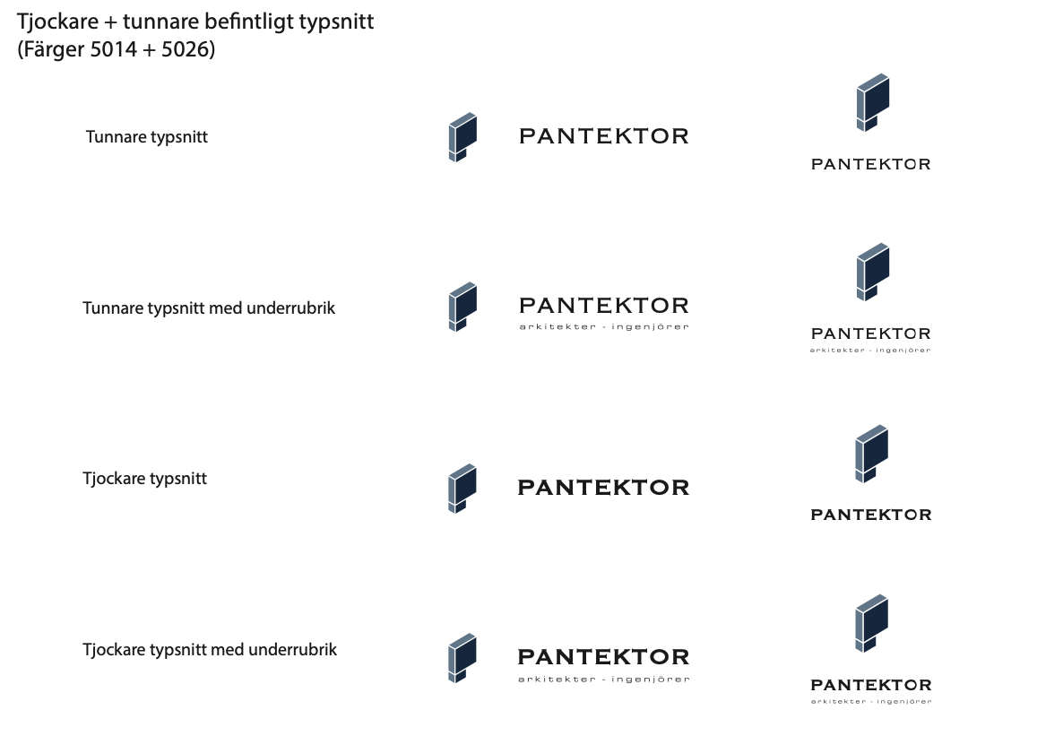
In terms of responsiveness, I initially planned on creating three versions of the logo; one big, one medium and one small, since that would result in a high level of versatility. However, by asking Pantektor in what contexts their logo is used today and is going to be used in the future, I came to the conclusion that they would only need two, one big/rectangular and one medium/square. By avoiding any excess details I would still make sure that it allows being scaled down a lot in size without losing readability nor recognition.
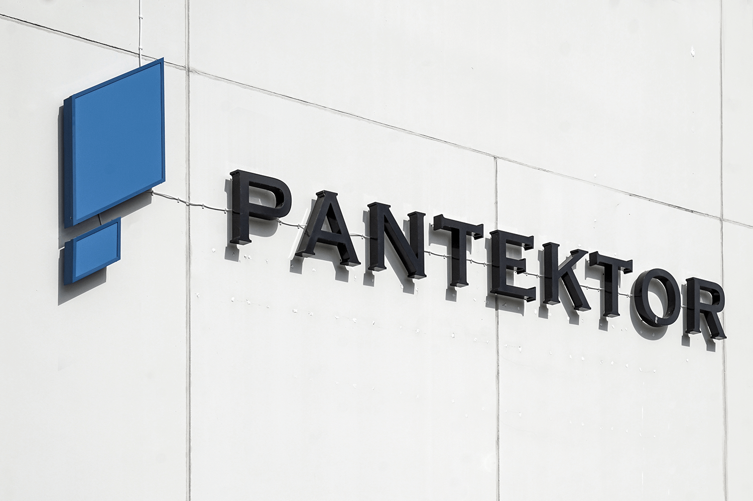
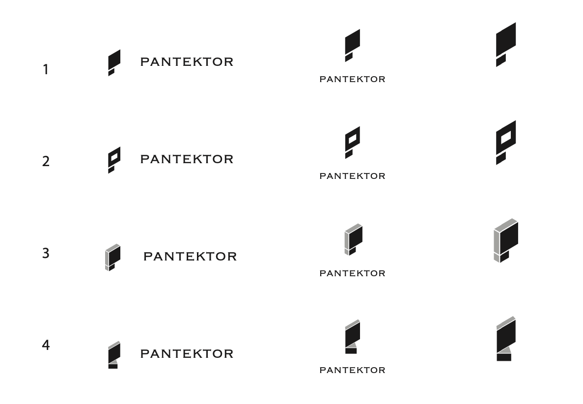
The look of the buildings that Pantektor draw can be described as industrial and robust yet clean with a lot of shapes that include straight lines and boxes. I had this in mind when working on the logomark as I wanted it to reflect their aesthetic identity. I looked for inspiration and got to the sketching board where I started playing around with the current logomark to see what new shapes it could be transformed into while remaining the look of a captial P.
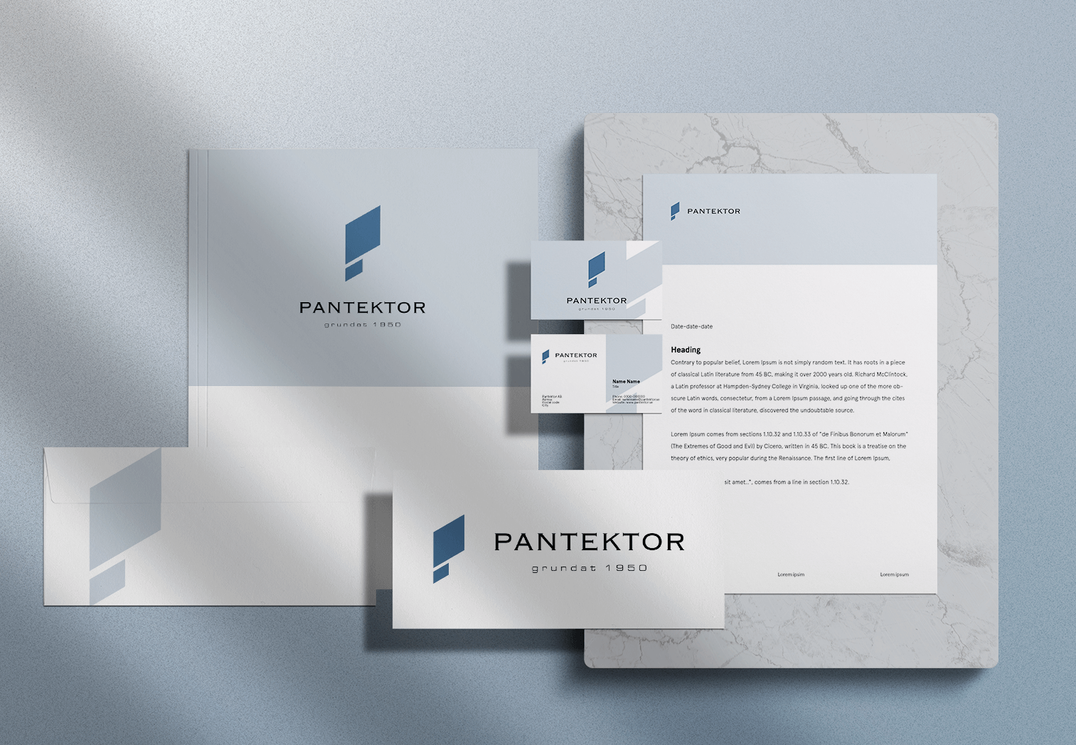
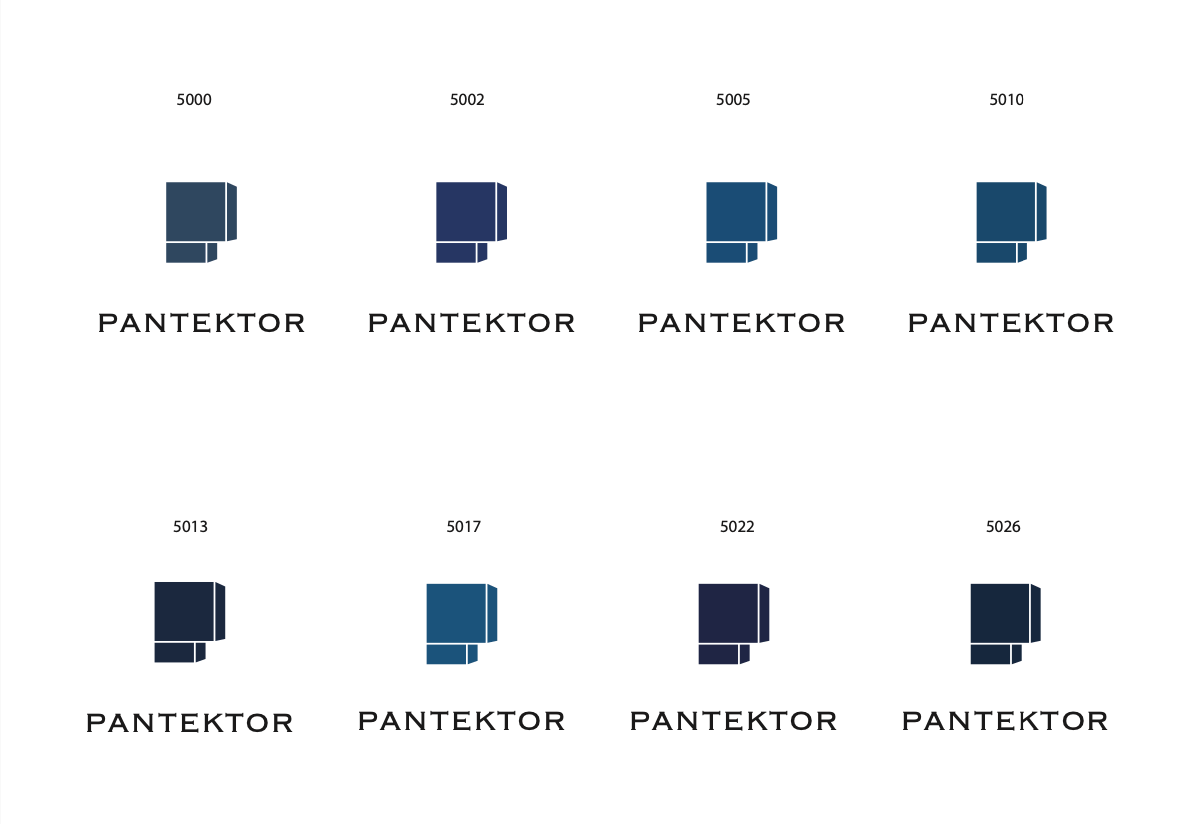
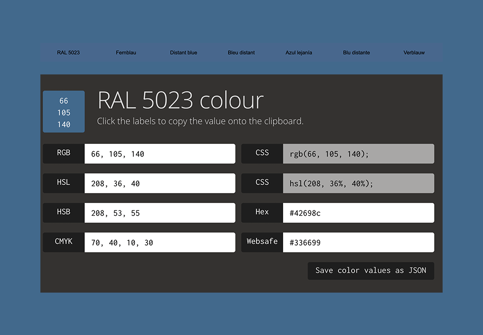
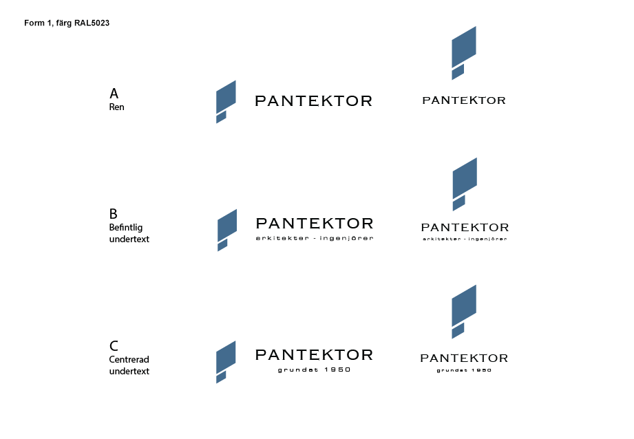
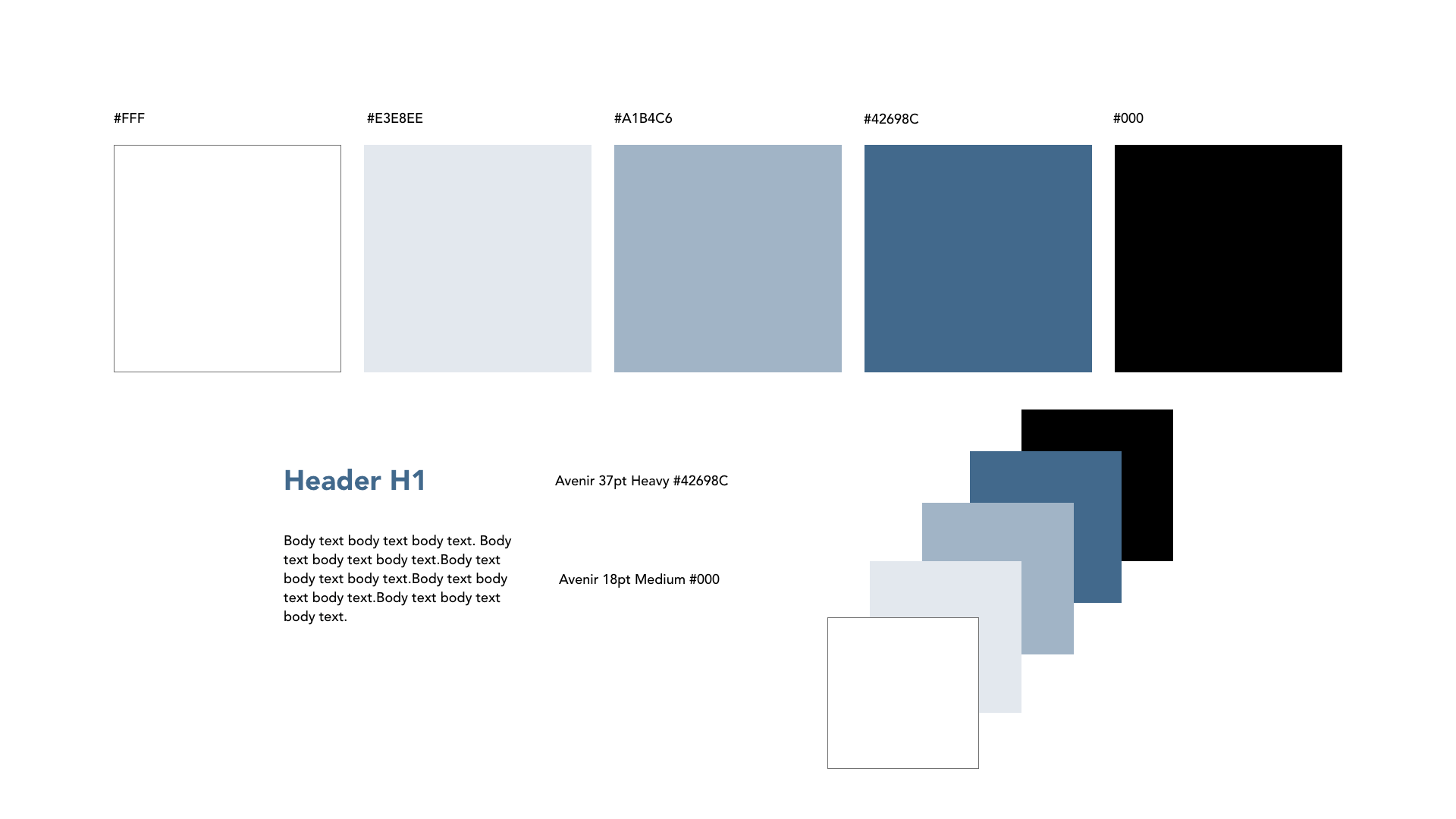
When asked why tradition is important, Pantektor answered that they believe it makes their clients trust in their expertise. They value building long term relationships with their customers that enables feelings of safety and reliability. This was taken into consideration when choosing color as, according to color psychology, the color that communicates trust and security is blue. One requirement was to stick with colors existing within the RAL color space as Pantektor´s logo is often printed on material like metal. My goal with the coloring was to keep the logo at a maximum of 2 colors to keep it simple and to make sure that it would work in color, in black & white and on different types of materials. I finally decided to go with RAL5023 because it is a greyish blue in medium brightness which gives that industrial/metal feel while having a good contrast to both the black text and a bright background.
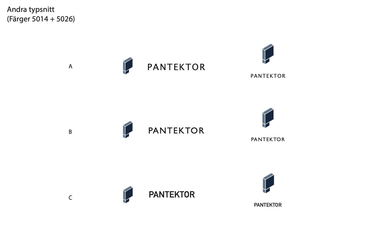
At one point I was asked to also try out some alternative fonts. I experimented with sans serifs in search of the modern and clean, but this look made the logo appear generic, and honestly boring, like made from a logo generator. To keep the change of the logo gradual we then decided to keep the font Copperplate because it inhabits the industrial and robust look while also already being associated with the company. I instead suggested removing the subheading as well as "AB" from the heading to make it more clean.
Both parties agreed that a diagonal shape was preferred for the final logomark as it breaks free from the feeling of being too "boxed in", which they want to avoid their company being associated with. As it points upwards it could connotate progression and success which is a lot more appealing. Stripping it down to the absolute minimum without losing readability we finally landed in the simplest of them all as it was considered the most sustainable. It ticked all the boxes; is timeless, is scalable, has the look of a P, has a maximum of 2 colors, avoids excess details and maintains high contrast to a number of color/material variations. As Pantektor requested the possibility to switch between different subtitles in different contexts I then compiled these in the final responsive logo.
The work with Pantektor´s website was initiated with an analysis of their current one to understand their goals with it as well as finding ways to improve it. Pantektor´s primary target group is customers within the logistics sector but they also want to open up for the possibility of receiving new types of project inquiries.
My research was centered around the website purpose, structure, content and visual appearance. I started with collecting information to define the goals for the website both from Pantektor´s perspective as well as their customers as this would serve as my foundation for all following design choices.
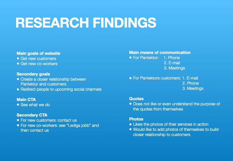
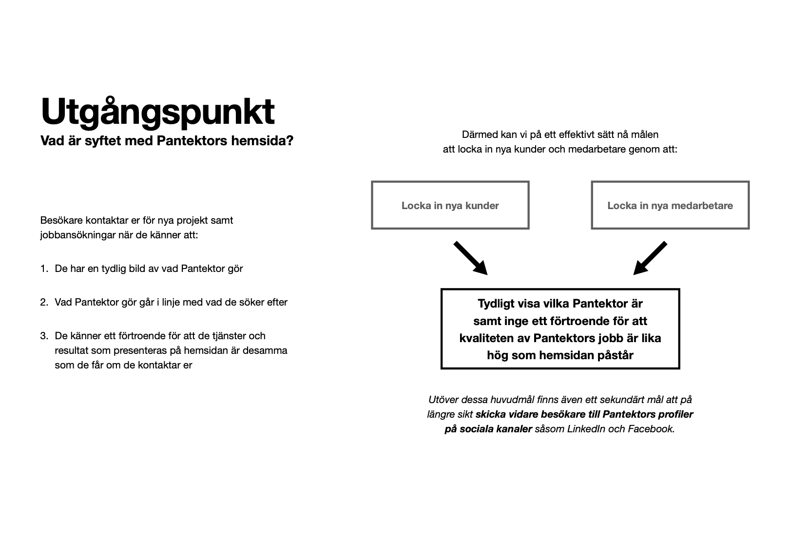
Through an interview with Pantektor I found out that their two main goals with their website are to attract new customers and to attract new colleagues. In the longer term Pantektor also want to increase traffic to their social media channels which was therefore considered a secondary goal. Following this, I had conversations with people from Pantektor´s primary target group to learn about what they need when visiting an architectural firm website for a new project and then contacting them with an inquiry. My main takeaways from this was that they need to clearly understand what the company does to be able to determine whether or not their services are aligned with the type of work they want to have done, and want to know that they are reliable to work with before contacting them.
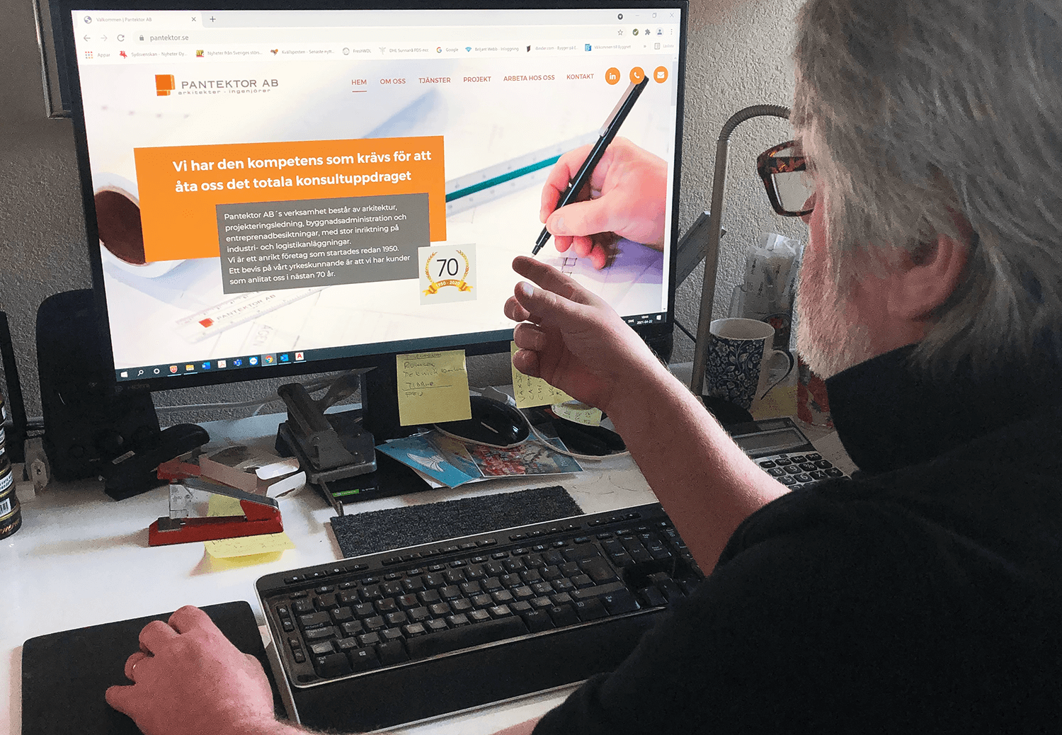
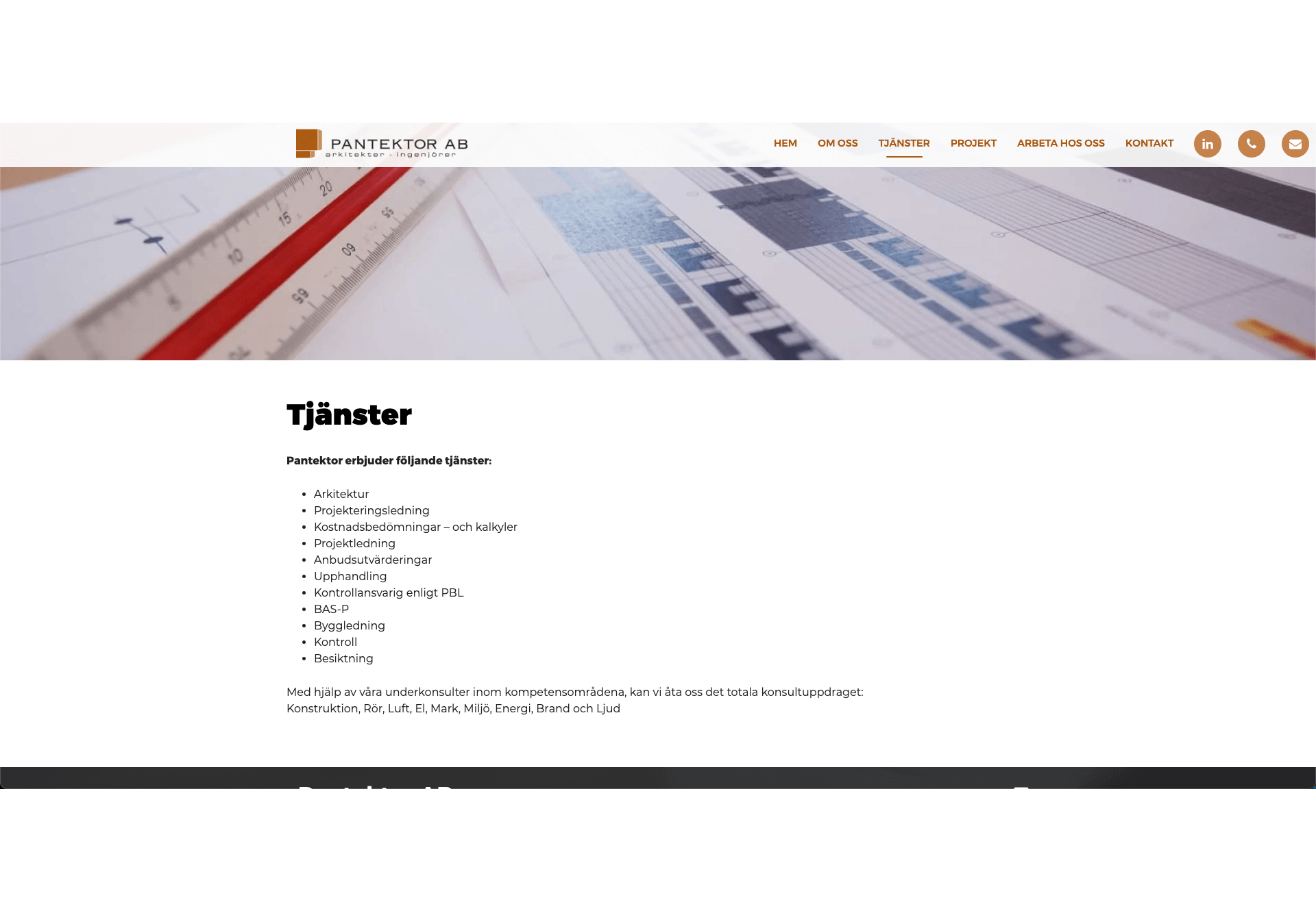
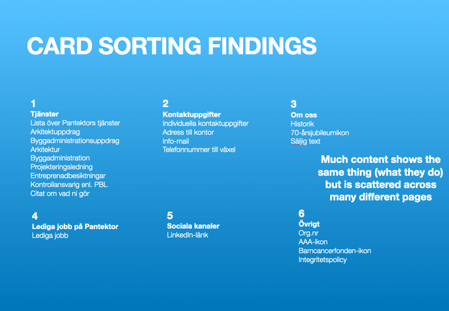
From having defined the goals I could analyse Pantektor´s current website to see what aspects of it that were effective and which ones could be improved as I now was able to make a better judgement of what information would be needed, how the information architecture should be designed and what CTA´s would be crucial or beneficial. A big take from my analysis was that the website needed more personality - human qualities such as a more relaxed copy and social proof - to be more attractive and trustworthy to both new customers and potential colleagues. It was also apparent that a lot of information says the same thing but is scattered across multiple sections and pages which makes it hard for the user to navigate and find what they actually search for.
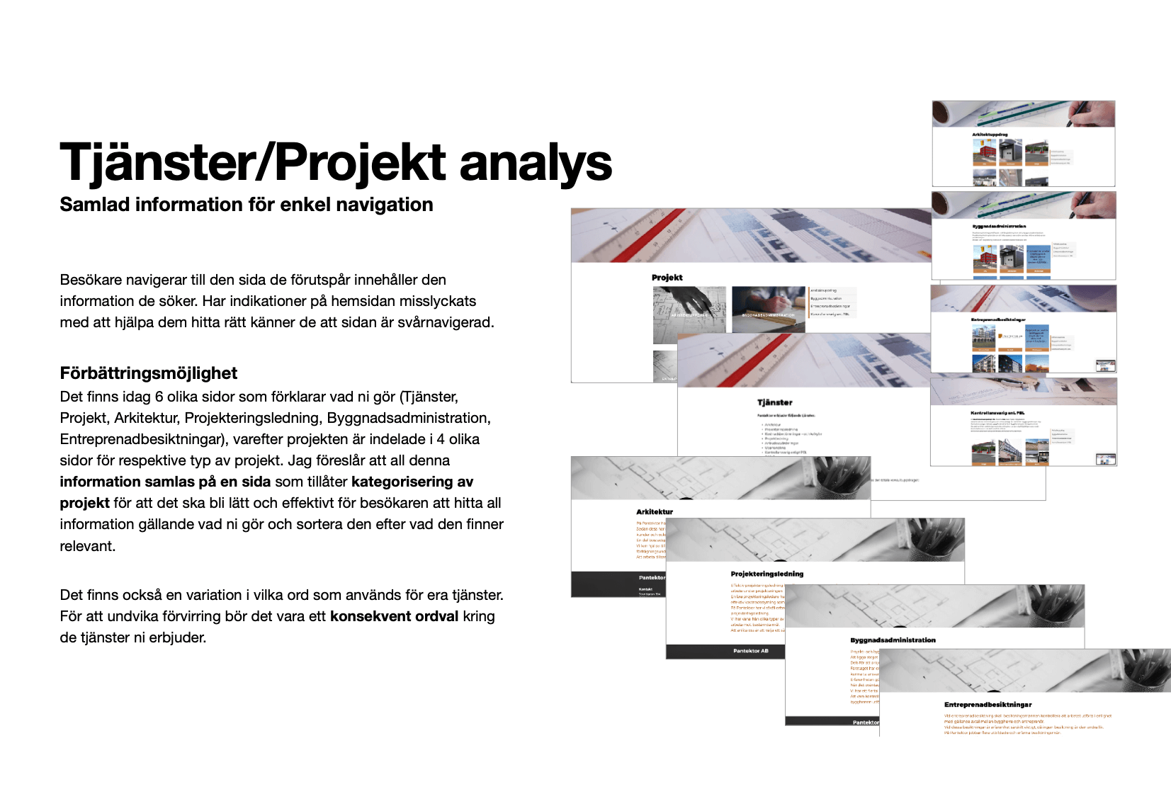
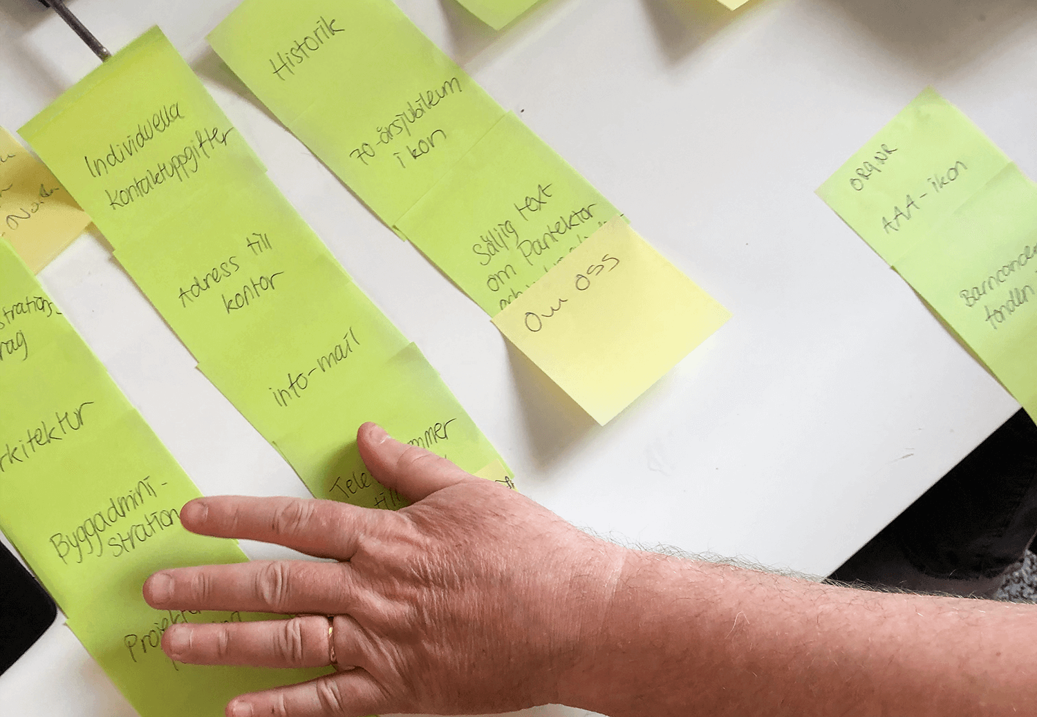
I chose to conduct a card sorting exercise with Pantektor to see how information could be structured in a more logical manner on the website and understand what was the most to least important. Through this exercise I was able to compile the information into new categories that make more sense and are easier to navigate through. Now I also had the basis ready for what pages were needed on the website, what content they would include, what links should be in the menu bar and footer and in what order they would be placed.
From this I was able to define individual goals for each page and then organize in what order information should be structured on them to fulfill those. I made a list of all elements needed and and what the text would communicate.
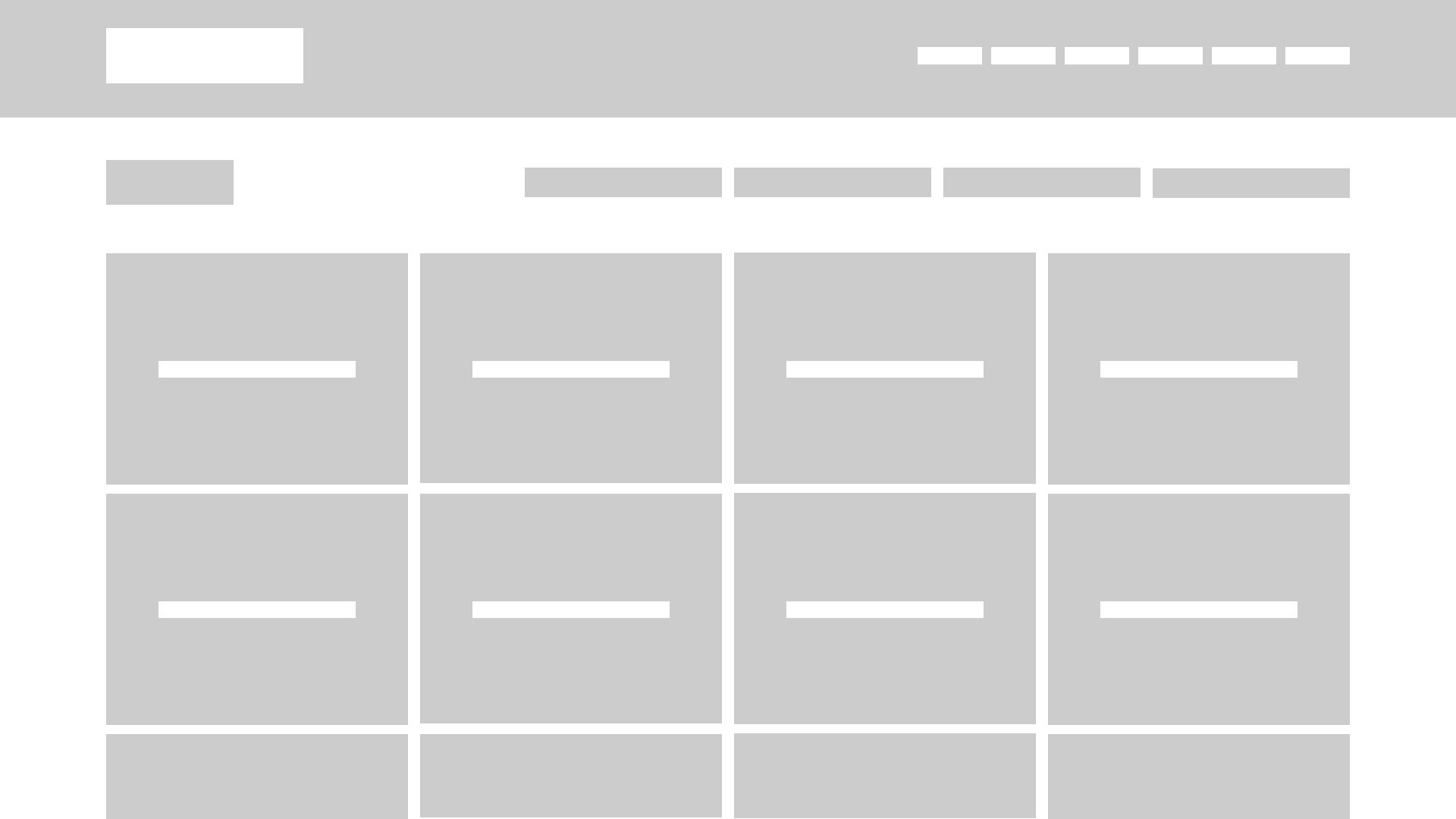
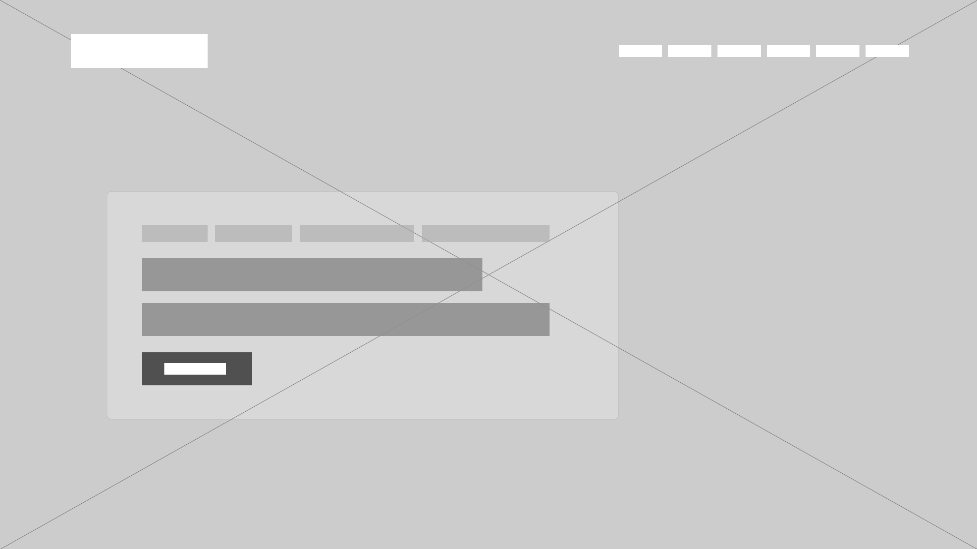
When having all the data needed to start wireframeing, I did so in low to mid fidelity to try out the website composition and aspects of visual hierarchy such as size and contrast.
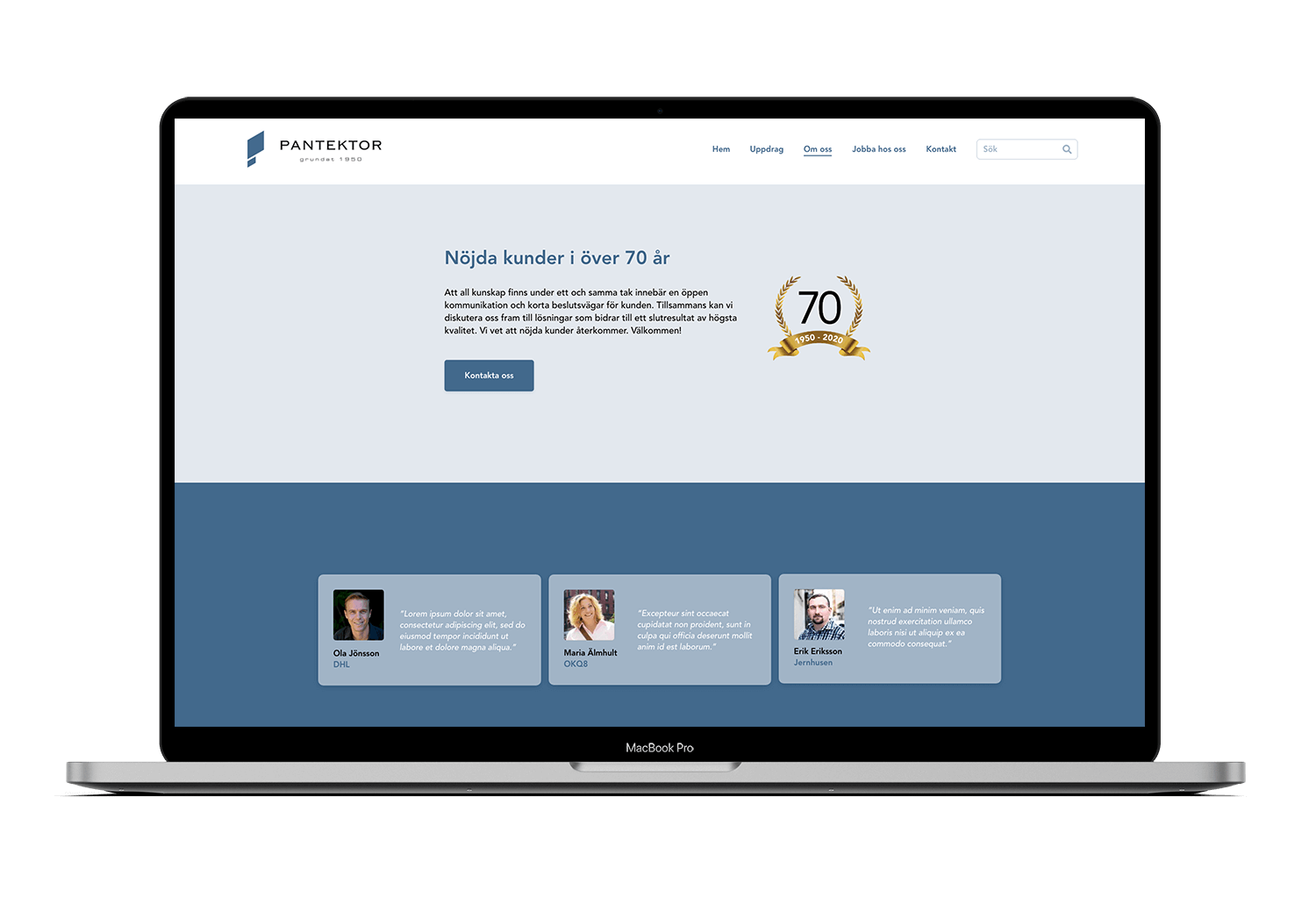
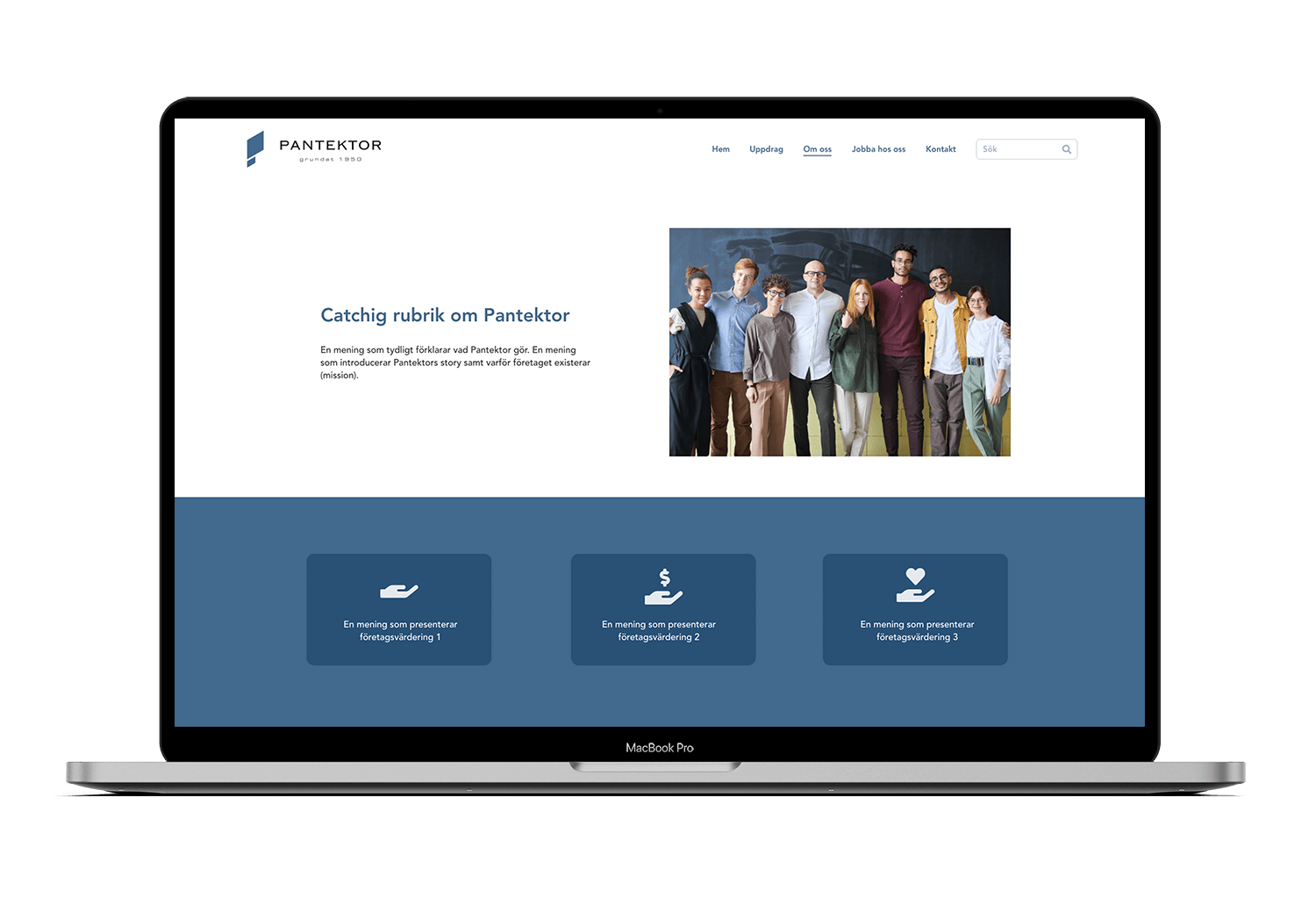
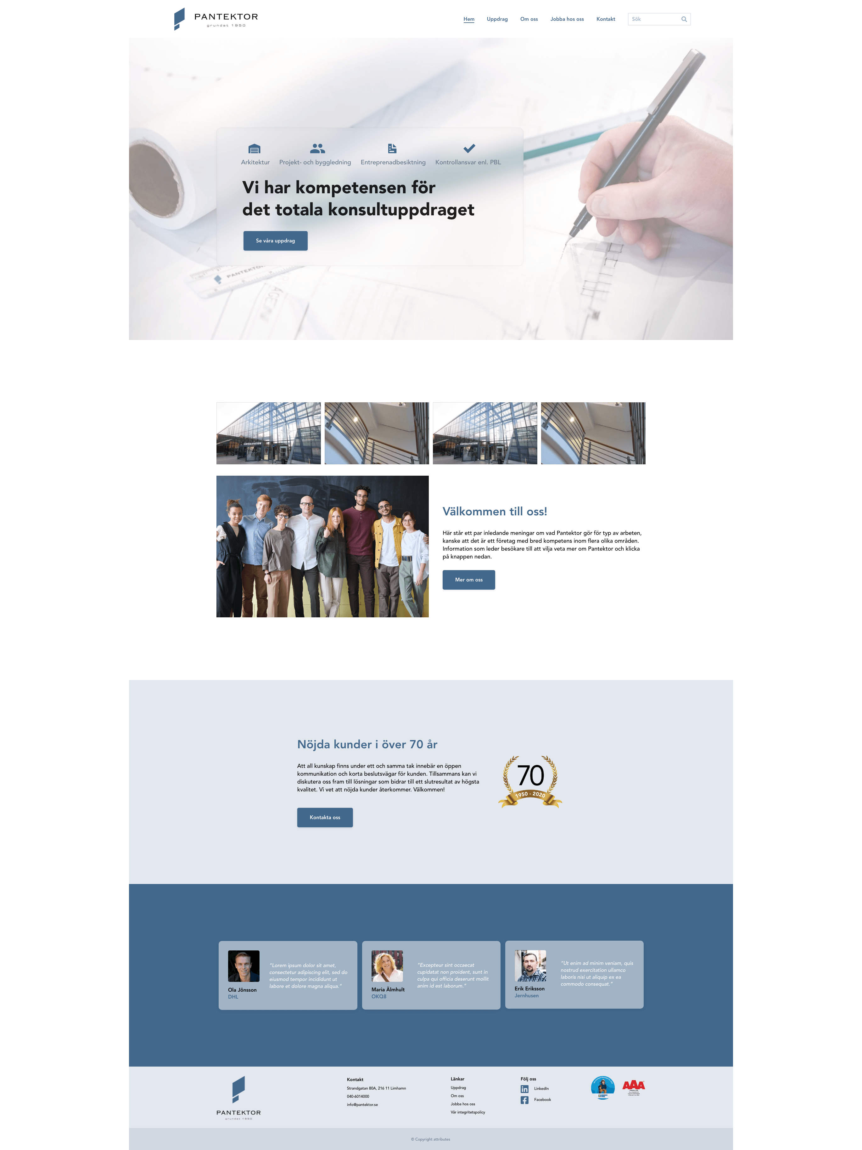
I then planned the visual apperarance which I based on a few key words on what experience Pantektor wants visitors to have on their website, which were professional, trustworthy, easy to follow and inviting. I chose a clean sans serif typeface and a black/white/blue color scheme based on the blue color in the logo for a consistent brand experience. I strived for nuances that work harmoniously together and could be combined in several ways whilst maintaining high contrast. From this, I designed the reoccuring assets such as buttons, navbar and footer. Here I added crucial functionality such as a search function and link tree that was missing on their current website.
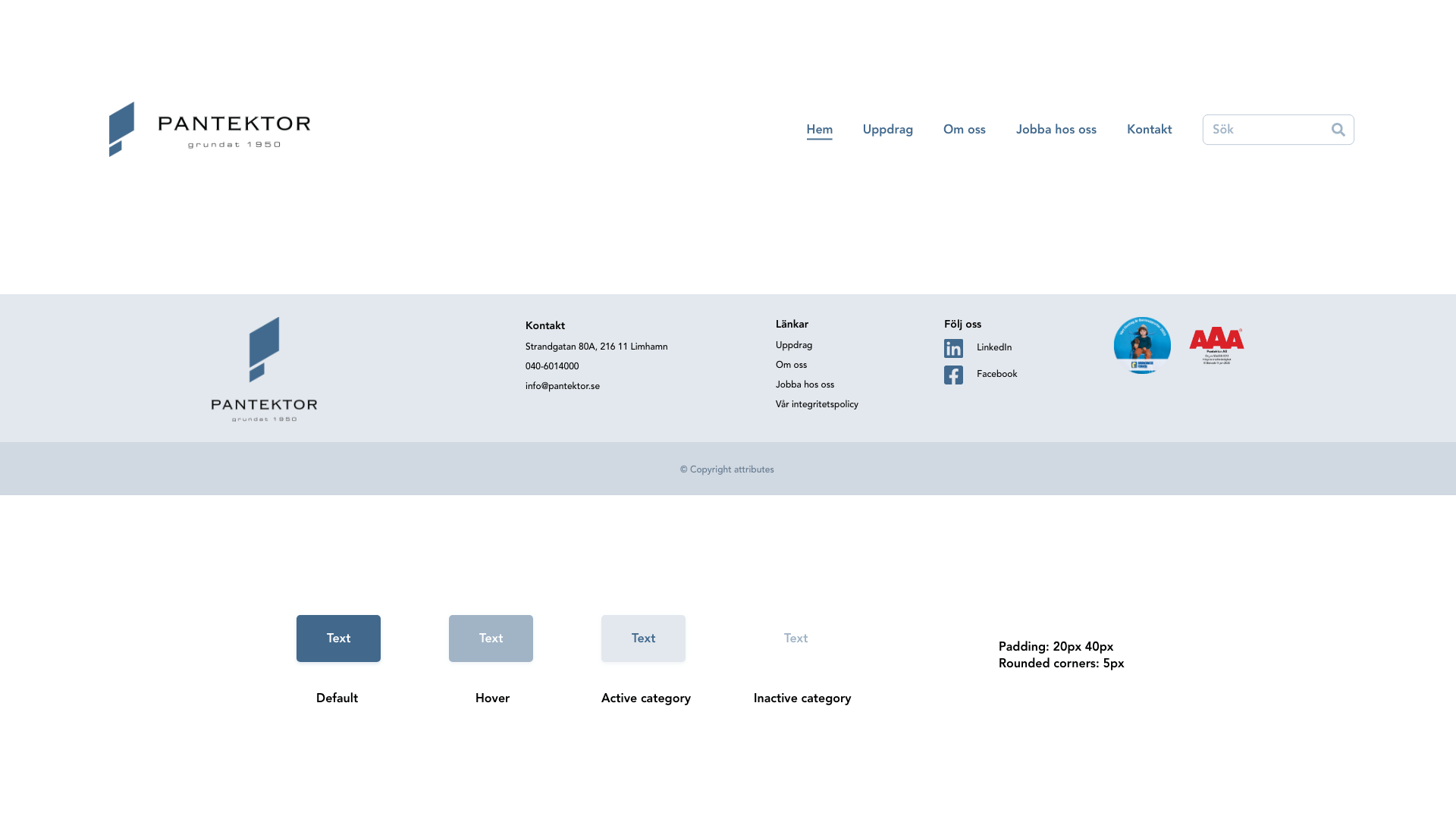
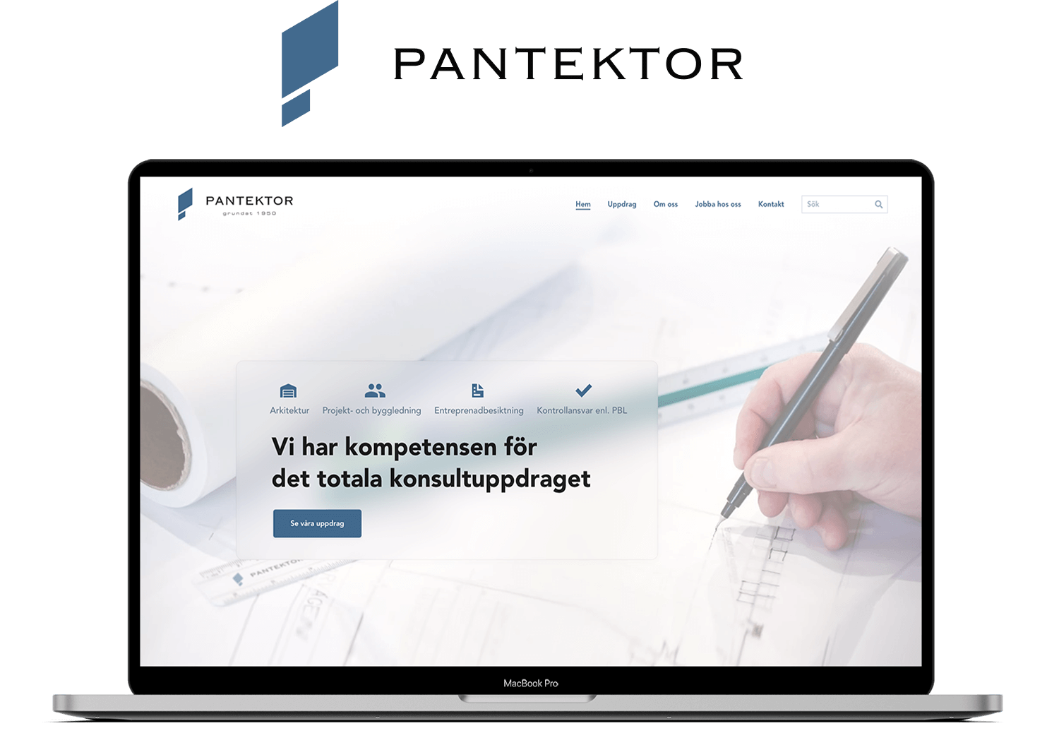
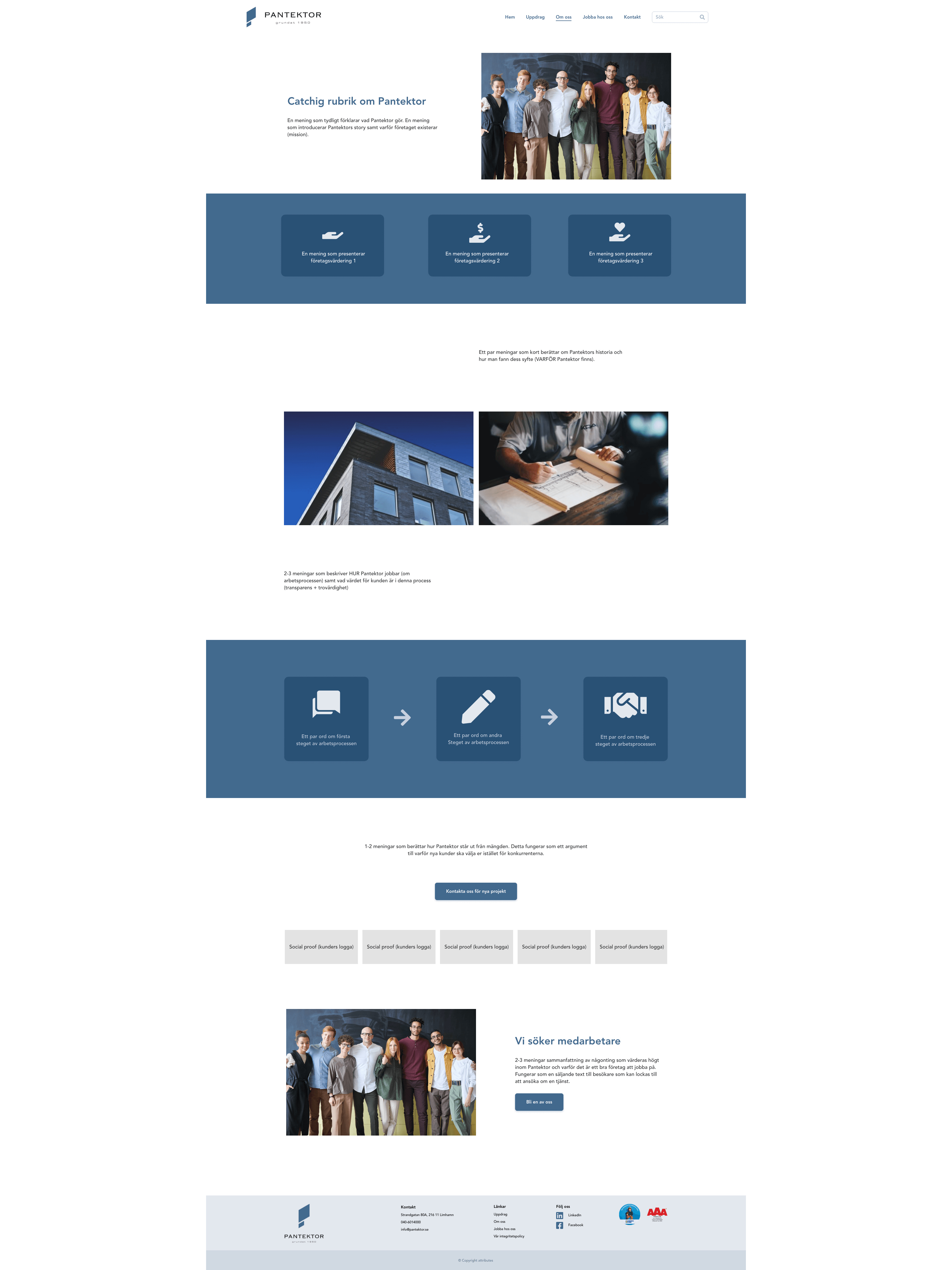
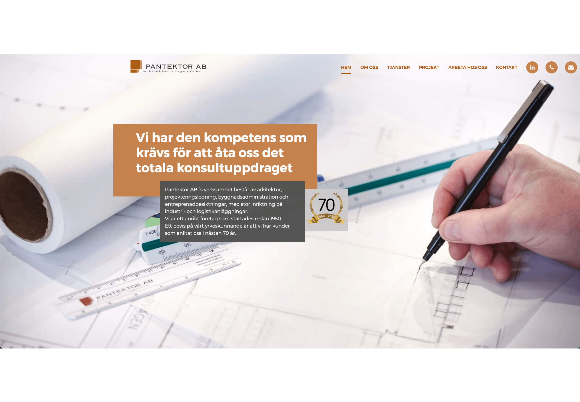
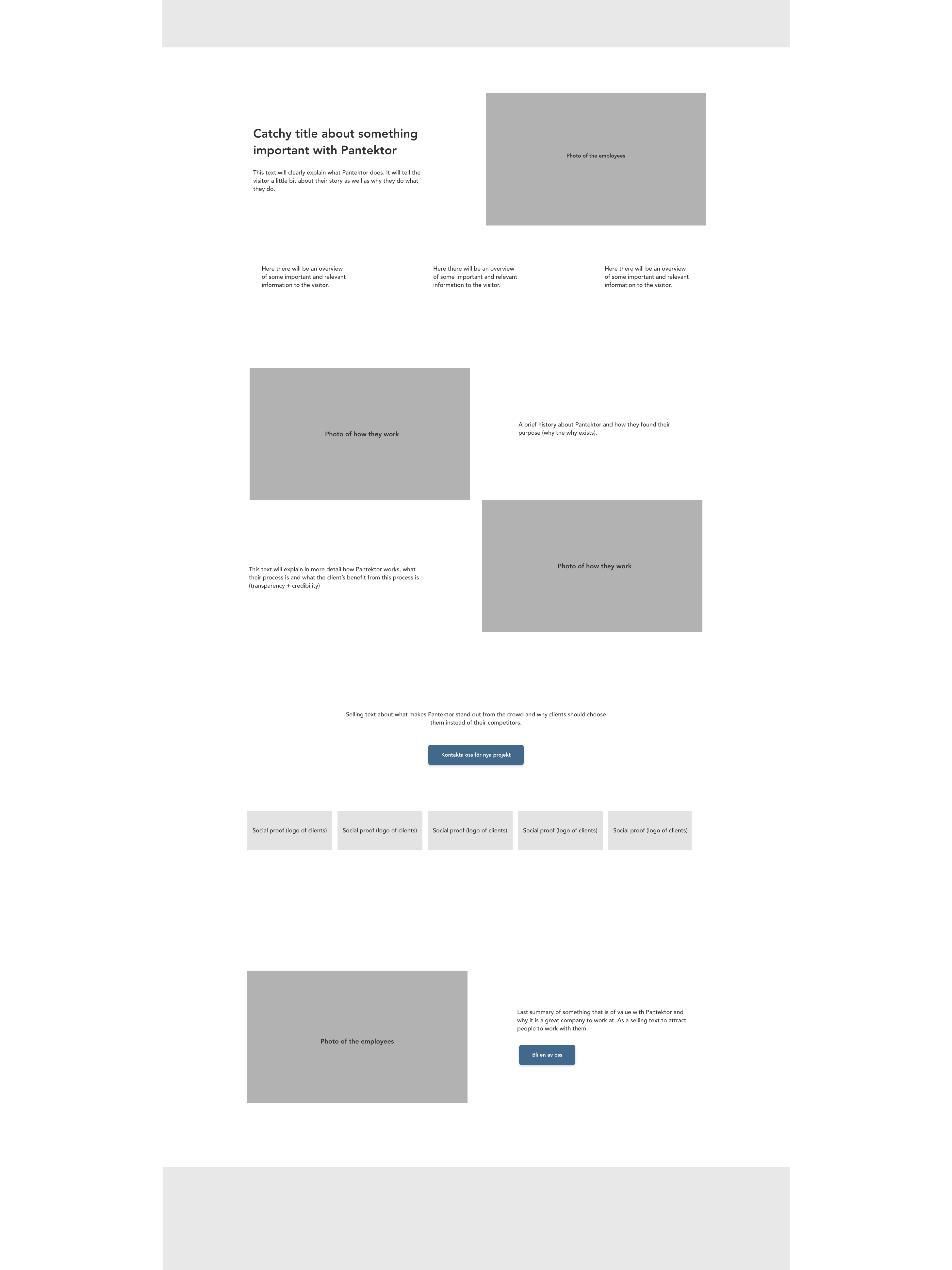
Then I designed the mockups. Above the fold, the landing page provides a quick and clear overview of what Pantektor does and a CTA to their Projects page, as this is the most relevant for visitors to see first. Below the fold, it presents the people behind the company in a more personal way with an introduction to why they do what they do plus a CTA to About us. The last section focuses on building trust with social proof and a CTA to Contact us. The About Us page takes visitors closer into their company by communicating the reasons for why they do what they do as well as how they do it. Here I added photos of the employees and their work in action to strengthen the relationship between them and the visitor. It has one CTA to contact Pantektor for a new project along with more social proof for the visitors who were not convinced of doing so on the landing page. As this page is important to visitors looking for a new job I also added a section with a friendly invitation to apply for a position as well as a CTA to Work with us.
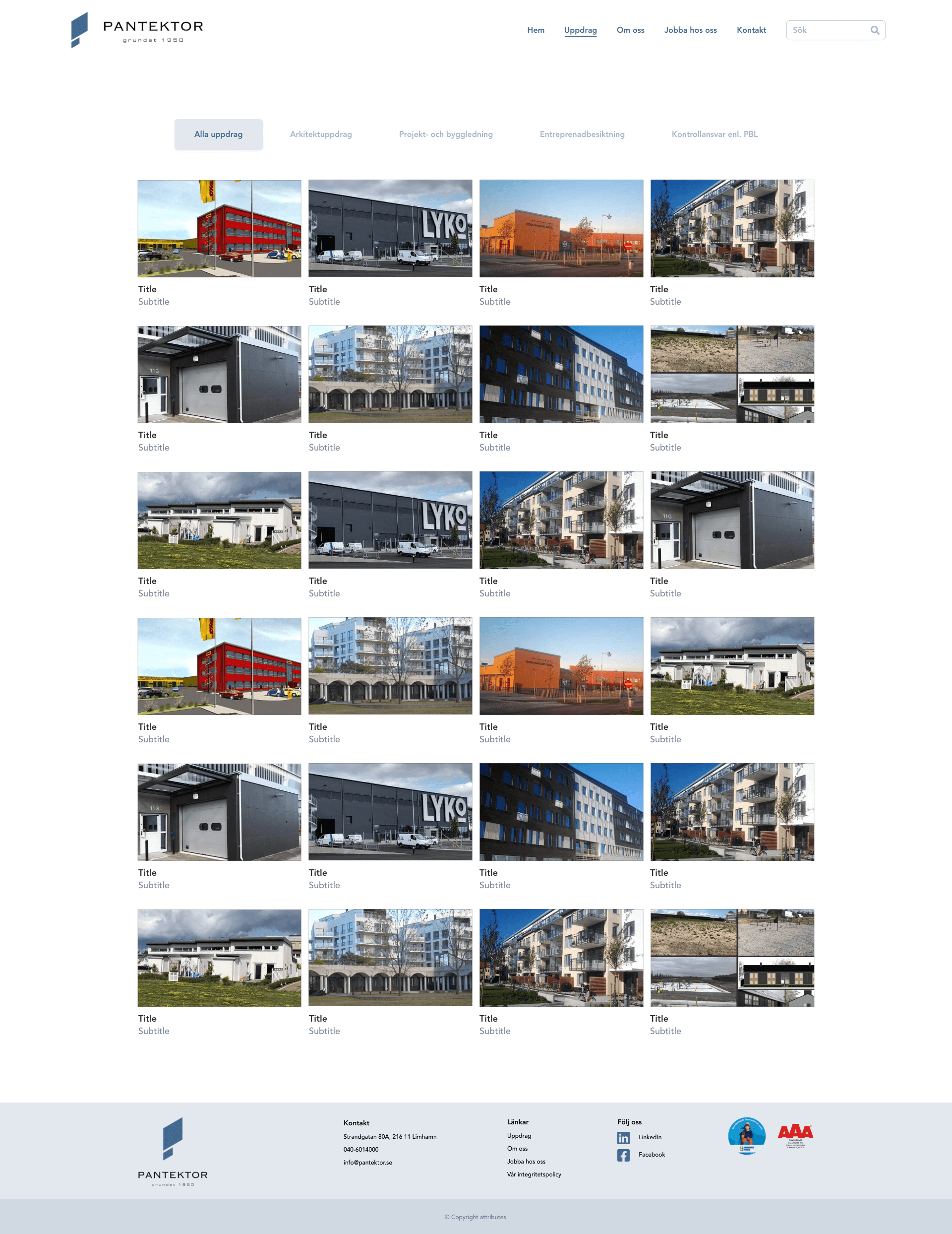
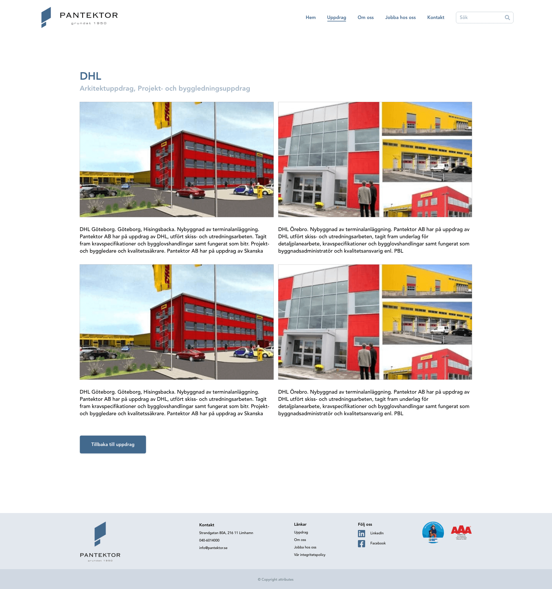
On the Projects page I changed the structure from 4 different pages with different kinds of projects into one page containing a categorization where the visitor has the option to filter out what is relevant for them to see. As some projects have a lot of images and information I chose to display each project on a new page with a button to go back to the list to view another one.
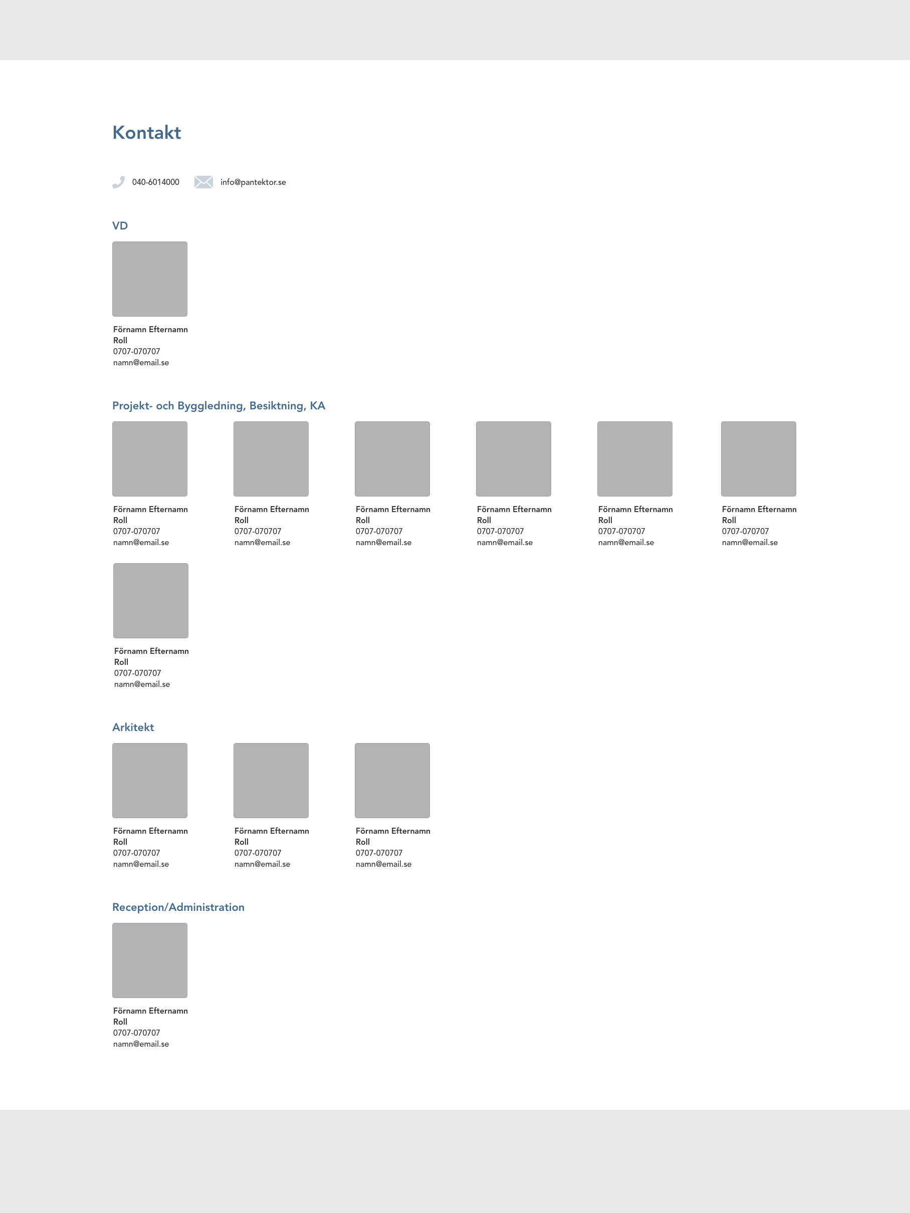
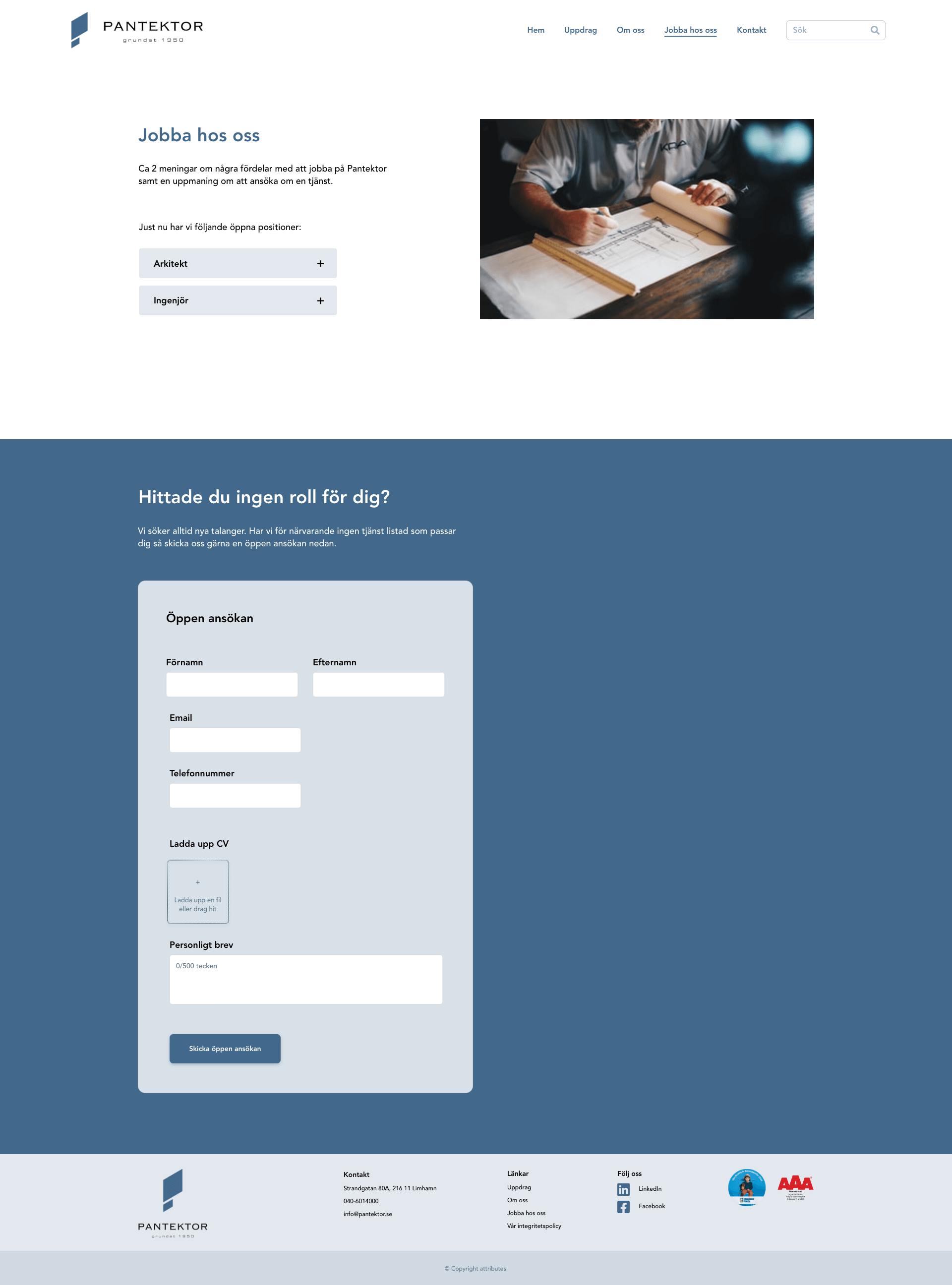
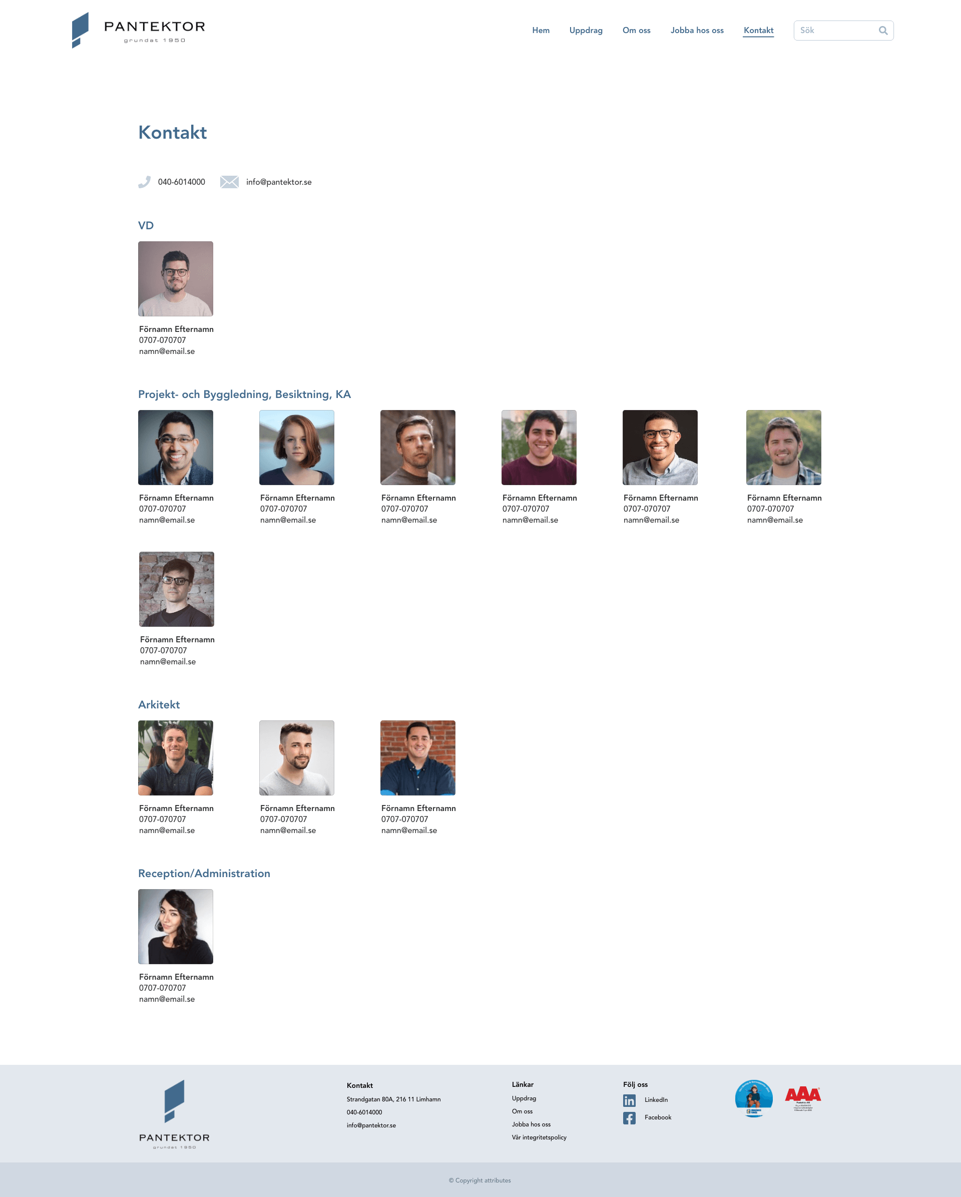
The Work with us page lists the current available positions at Pantektor along with an inviting text. I also added a direct application form to make it really easy for people to send an open application if there are no positions currently open or if they feel like they do not fit them. The last page is Contact us where I categorized the employees by their respective titles to make it easy for visitors to find the right person to contact. Here I also added images of all employees along with their contact information to give the visitor an idea of the person before contacting them.
Before deploying the new website I will write the new copy as well as photograph the images needed such as portraits of the employees, their new office and some work in action.
Working with Pantektor has been really rewarding to me as I have been given the opportunity to learn about design fields I am less familiar with such as branding and logo design. Through this, I have understood the absolute importance of brand experience and how the thought process of UX design can be applied to almost every aspect of a company to affect people´s relation to it. I have learnt that seemingly invisible details can have a great impact on the experience of a company, and that people do not just want to buy a company´s services or products - but also the reason for why their services or products came into existence in the first place.